
For my senior capstone project, I decided to design a digital experience for the Student ID card for Android Wear.
Research
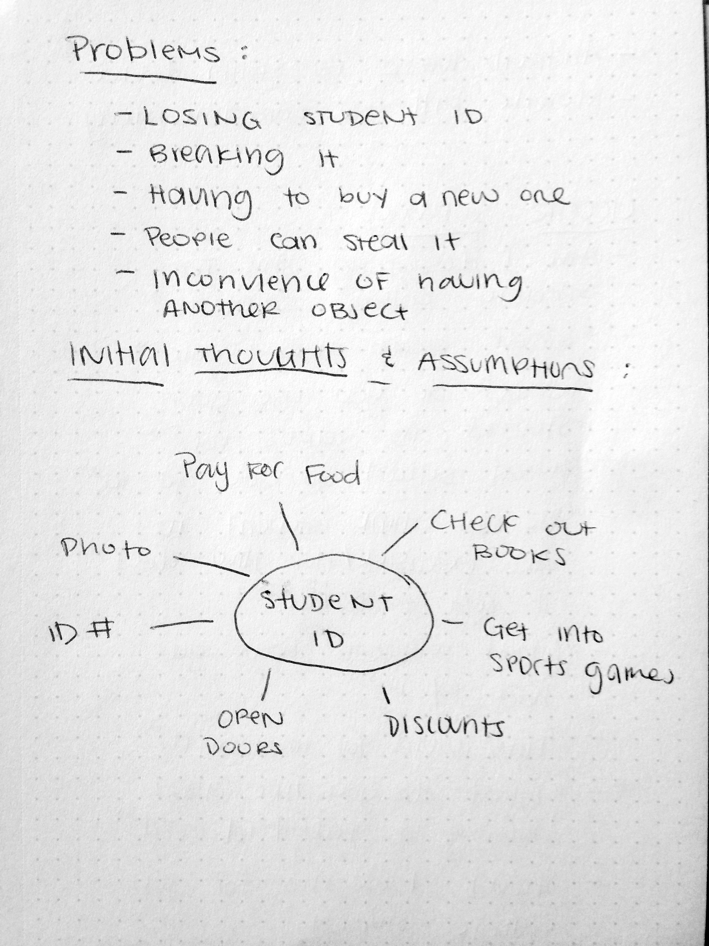
I'm a very data driven designer. I like knowing hard facts before making decisions and defining paths. I first wanted to see all my thoughts out on paper. I jotted down whatever ideas and assumptions that came to mind. I pieced things together and organized this initial information. This would help me figure out the rest of the information I needed to look up and ask other students.
I'm designing a digital experience for the student ID card. I'm limiting my audience to college students. I'm doing this under the assumption that most students possess a smart watch and an Android Phone. For this project, I'll be designing for the Nexus 5 and the Moto 360.
Survey and Analysis
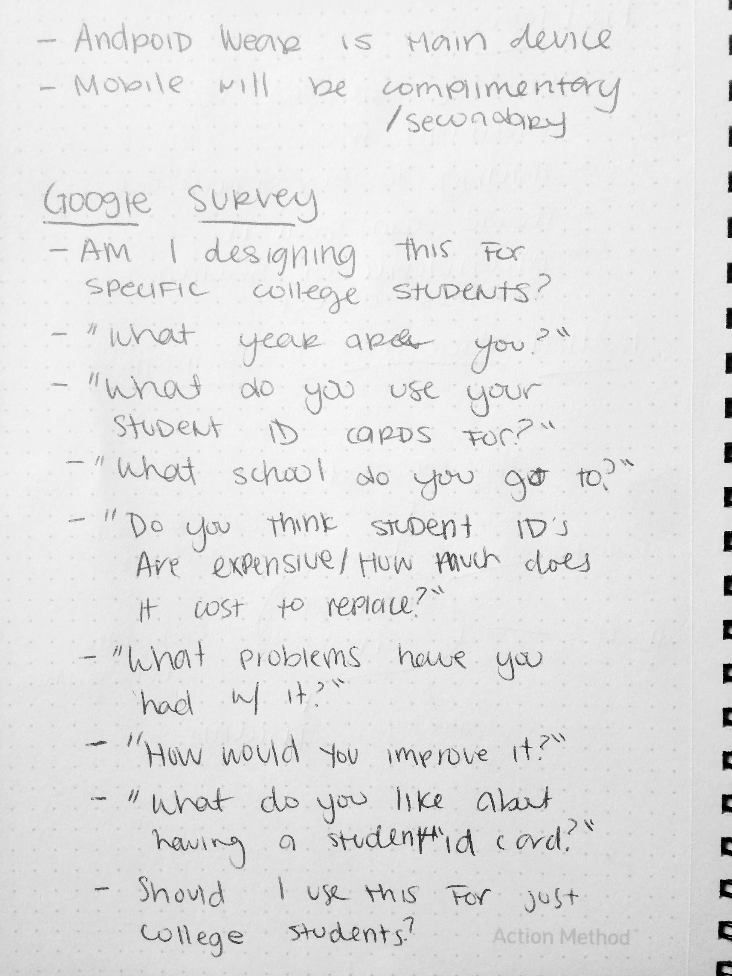
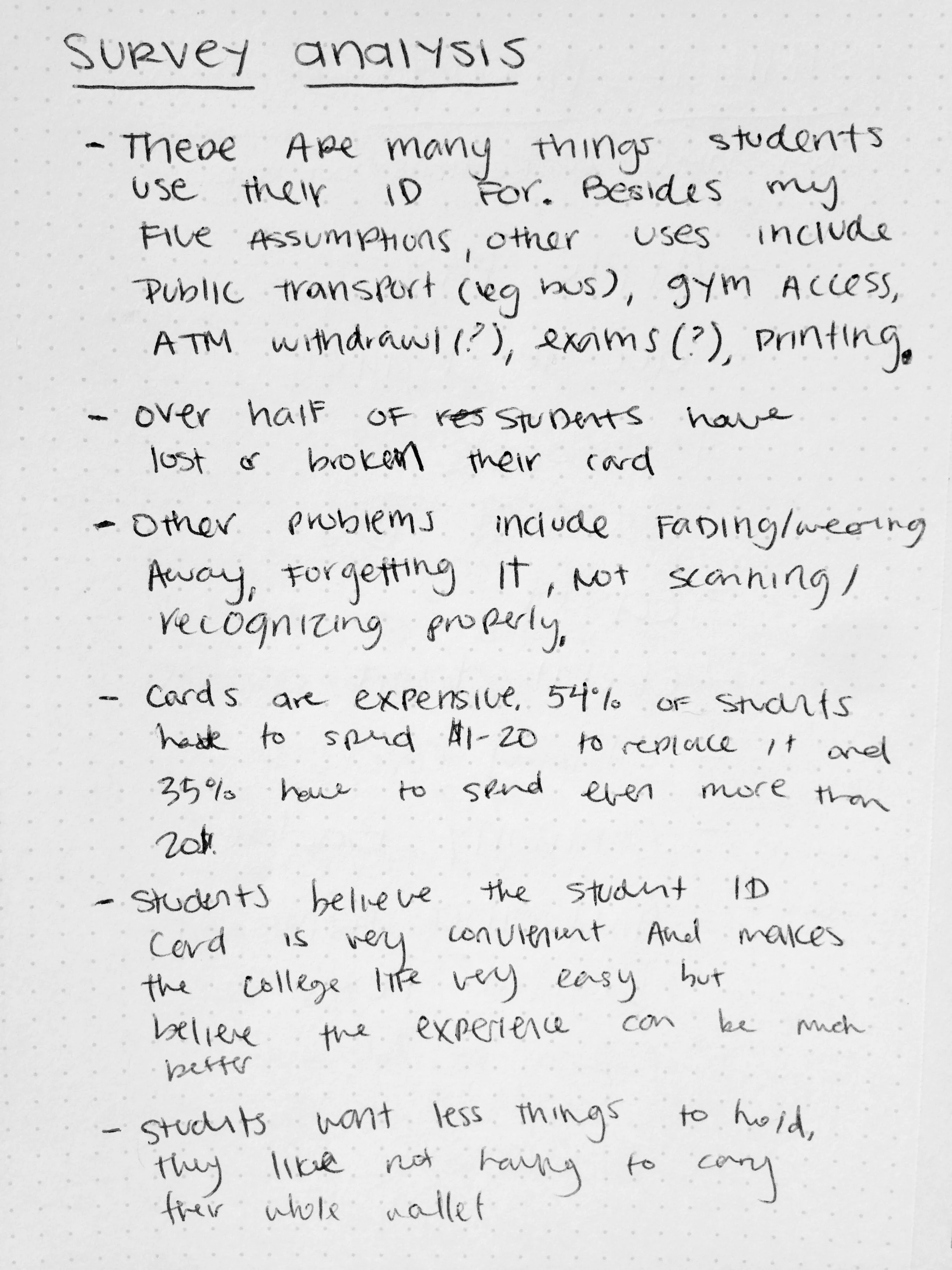
I surveyed 72 college students from around the country. You can find my Google Form Survey here.
Here are some of the results from the survey:
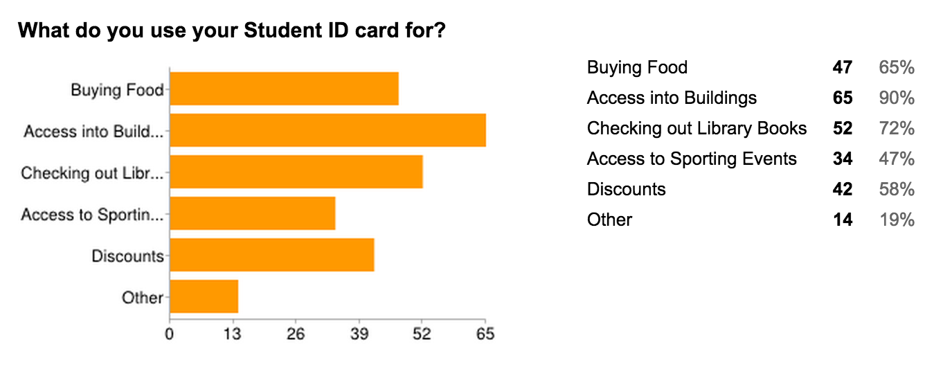
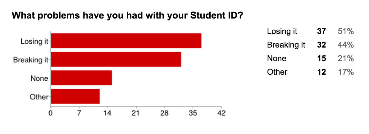
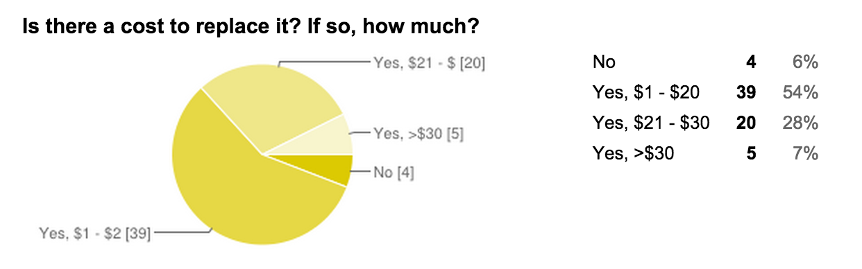
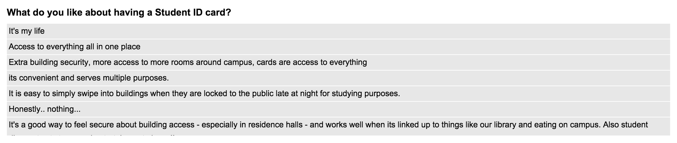
To view all results click here.
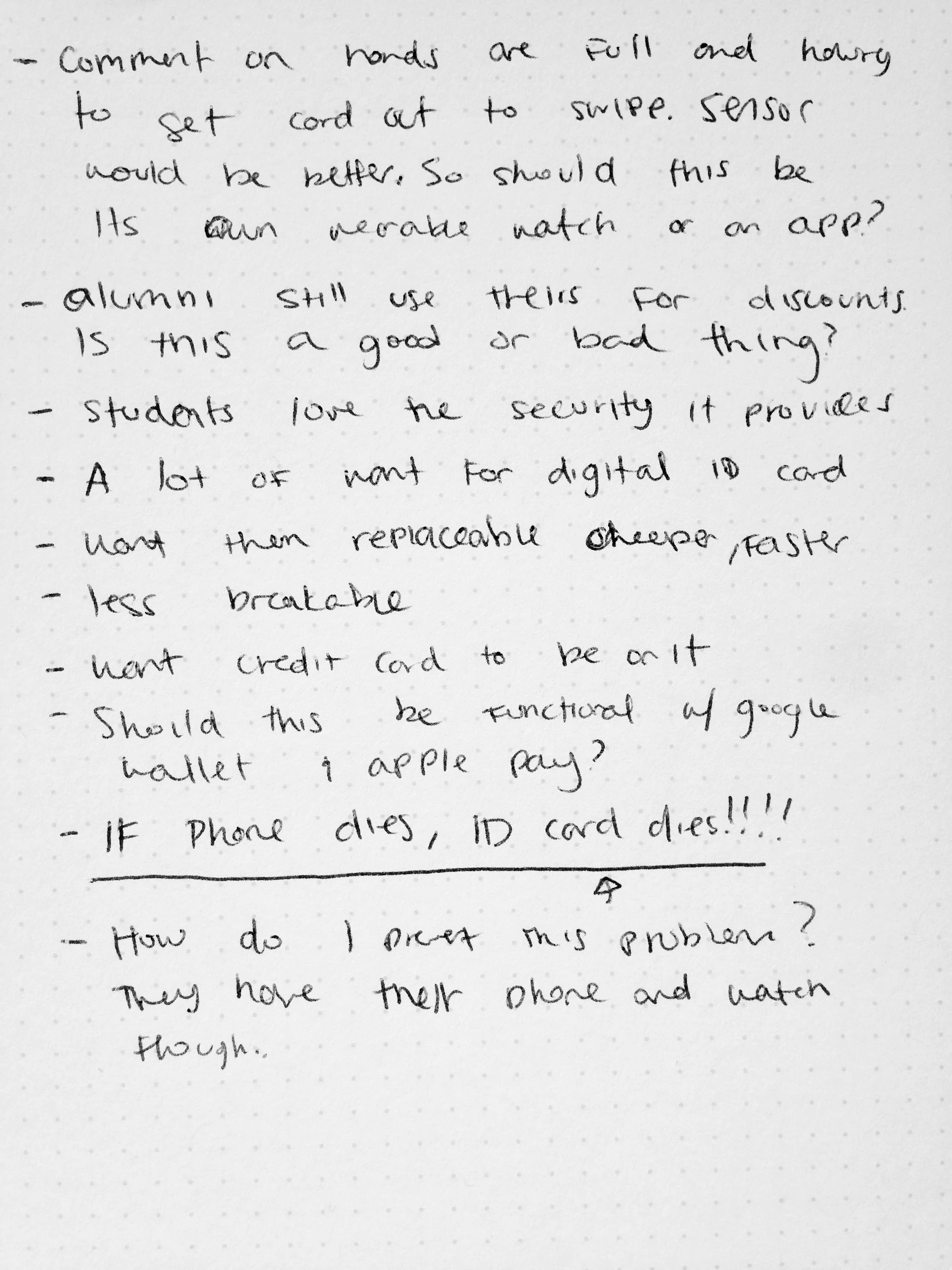
I found out a lot of useful information from this survey! A lot of my initial assumptions were reassured and I also discovered new ideas and problems from this feedback.
Defining the User
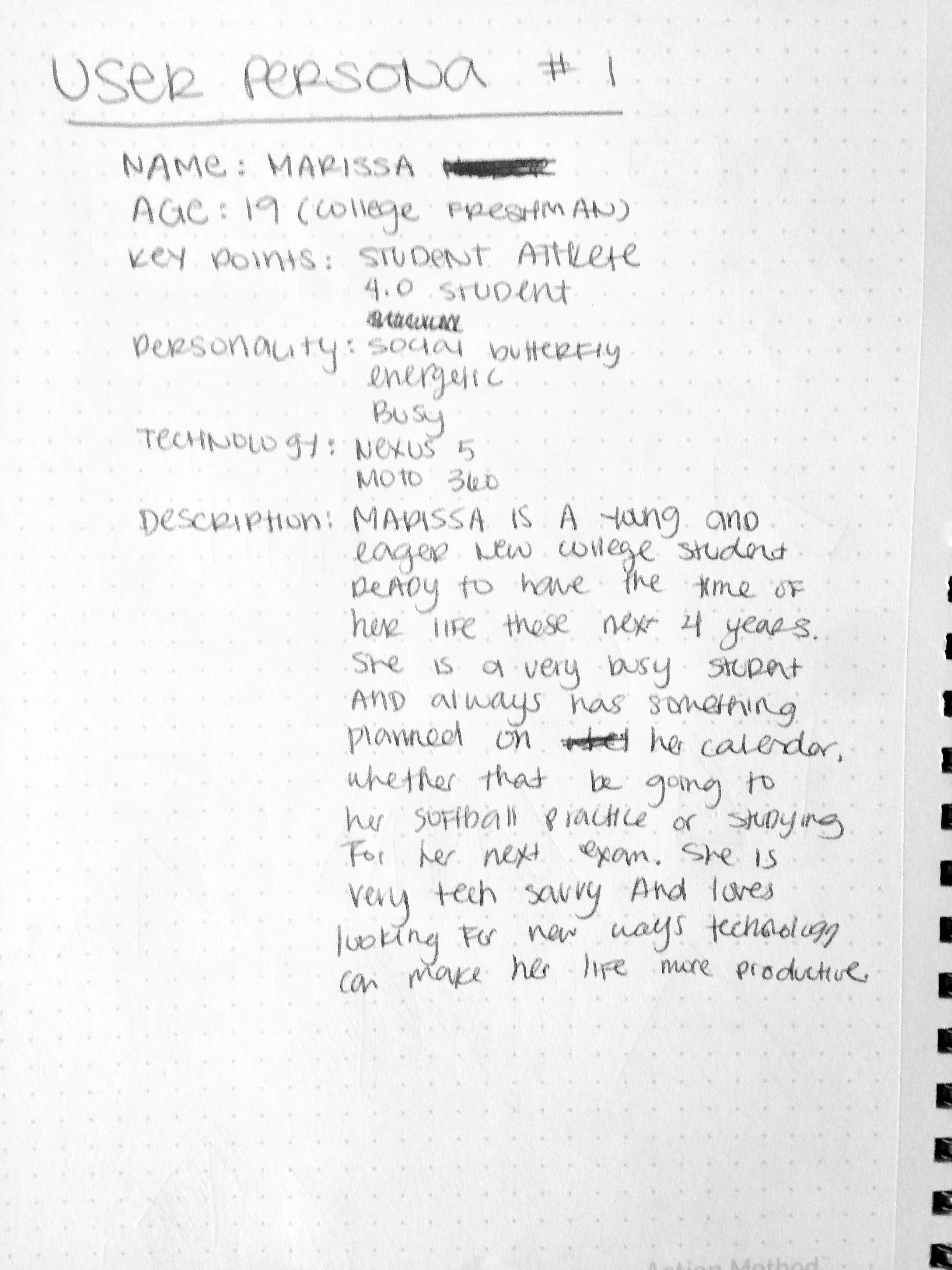
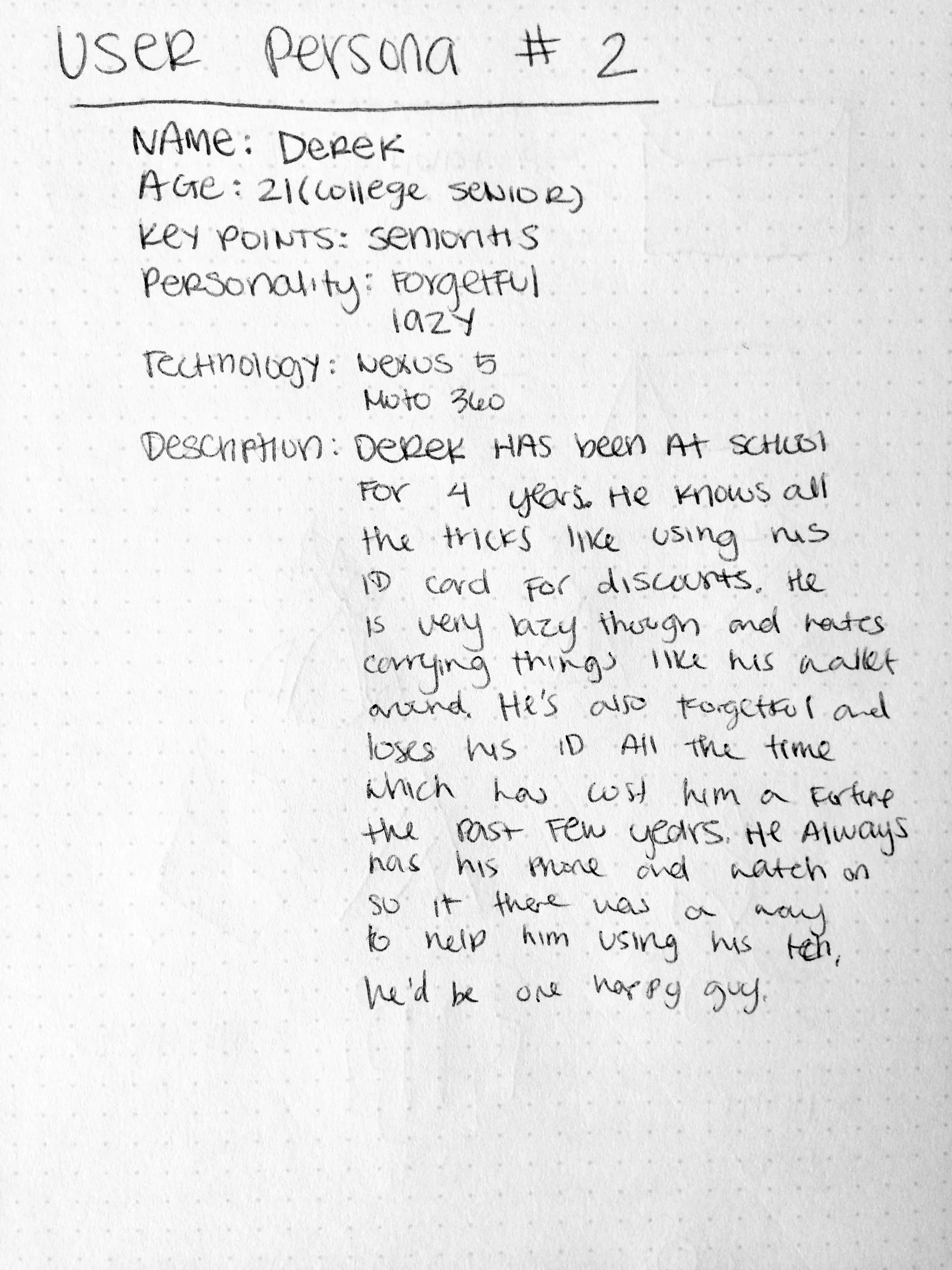
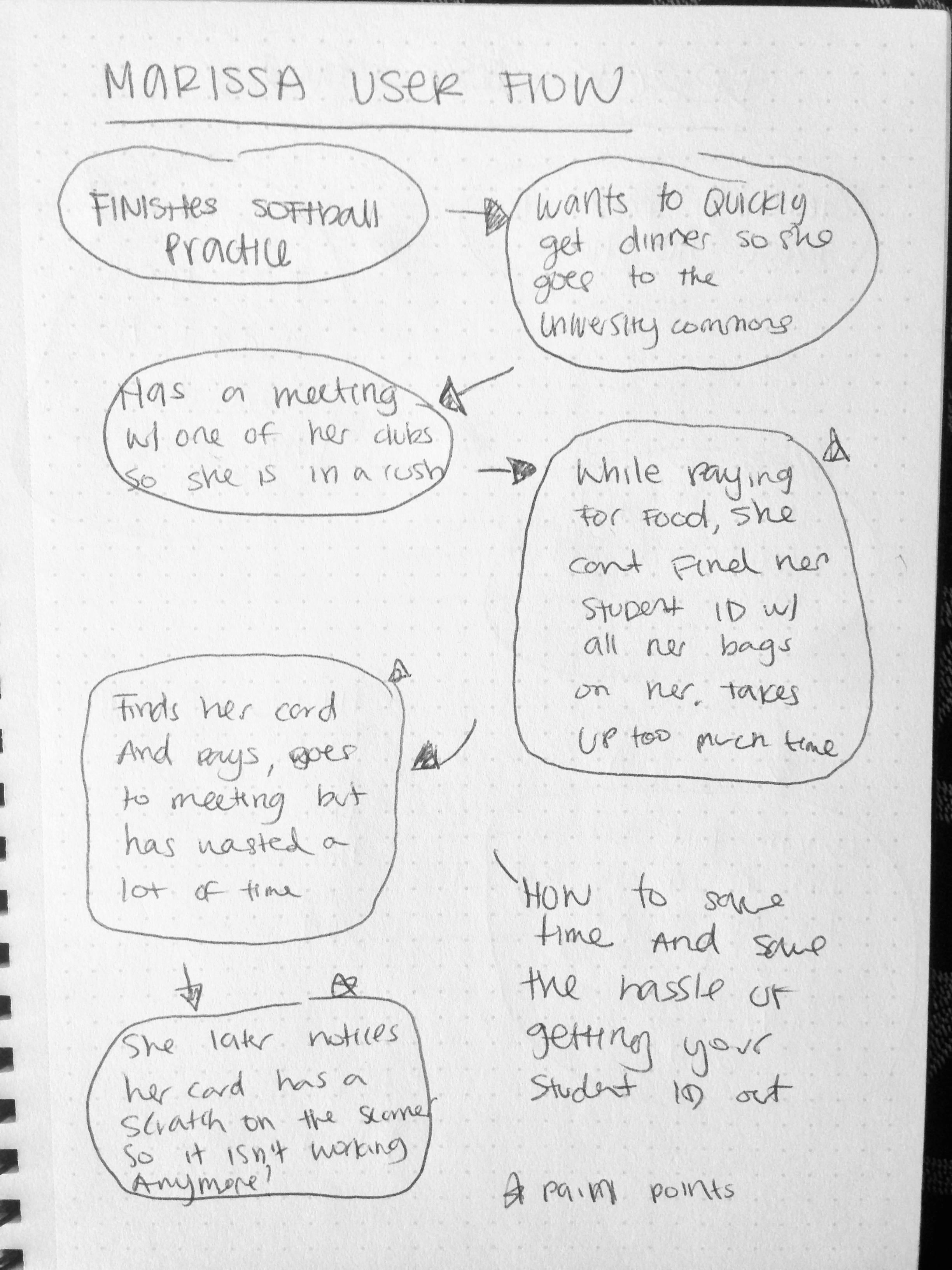
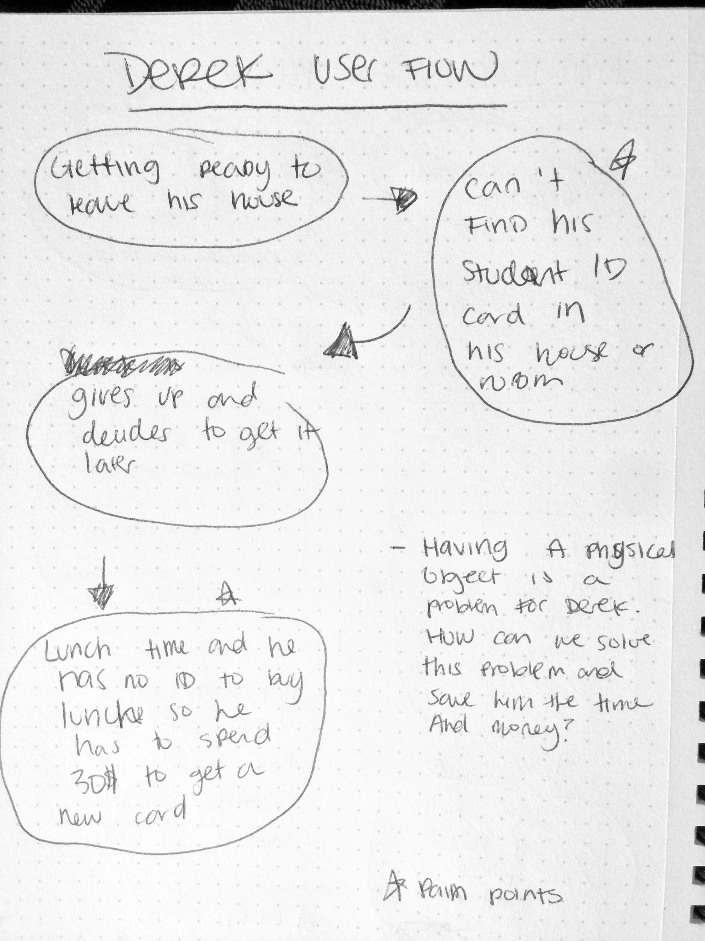
Next, I had to figure out who exactly I was creating this product for. I needed to create user stories to better understand why and how they would be using this. To create the stories, I had to develop some personas. Below you can see the two personas I created, Marissa and Derek. I designed scenarios for each of them and create flows and use cases for both as well. This will better help me decide on which path to take the product and make sure I'm solving the exact problems that they are facing.
Ideation and Brainstorming
Since I finally had all the facts I needed, it was time to start getting all my ideas down on paper. One of my favorite things to do during this phase is gamestorming! I love coming up with different ideas in a fun way and gamestorming is exactly that. I learned about this from the guys over at Google Ventures and also from one of my biggest role models, Brynn Evans. I chose to play the game "6-8-5". Here's the object of the game:
Rarely are ideas born overnight. And for an idea to become a great idea, it takes considerable work and effort to develop. Part of the reason we end up with under-developed ideas is that we stick with the first good idea we have — rather than taking the time to explore complementary approaches. 6-8-5 is designed to combat this pattern by forcing us to generate lots of ideas in a short period of time. The activity can then be repeated to hone & flesh out a few of the best ideas.

So, let's summarize what I've sketched here. "How can I make a better experience for the 'student ID card'?" There are many solutions to this but for this project, I want to explore and go more in-depth on the solution of using Android Wear and mobile to replace the physical card. I had some rough sketches on possible ideas of how to interact with the watch. I then interviewed several different students and asked them about what they thought about these sketches and their ideas if they had anymore to add.
Here are some things I've learned from the interviews:
- "I'd like it to sense a sensor as I'm approaching so I don't have to stop. If you have to stop, it's just as annoying as pulling out your card and swiping."
- "The reason I use my phone is because it's a comfort thing. I'm comfortable knowing that everything is on it and it's all I need."
- "I don't like pulling my phone out of my pocket every time I need to use it."
- "Automatic sensor is easiest but it would be bad if you're just standing next to the door and you don't want to open it."
- "Scanner to keep it consistent on different features around campus."
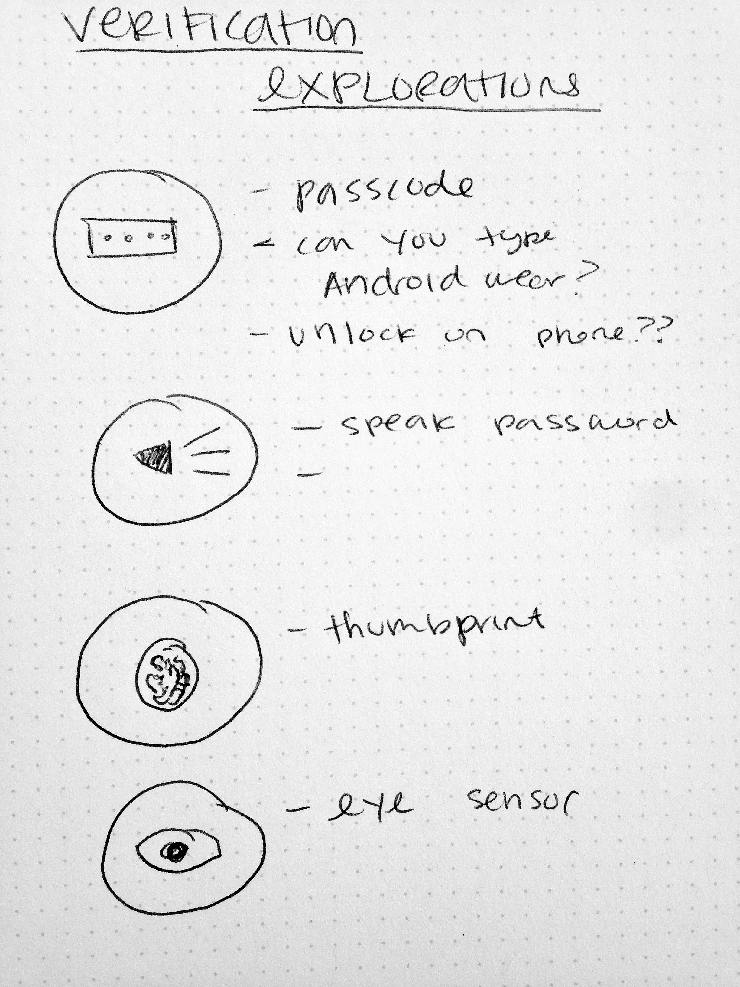
- "Respond to voice so it's more secure."
- "Verify that it's you when you put on your watch and when you take it off, it gets locked again. That way not anyone can just get your watch and tap it on everything."
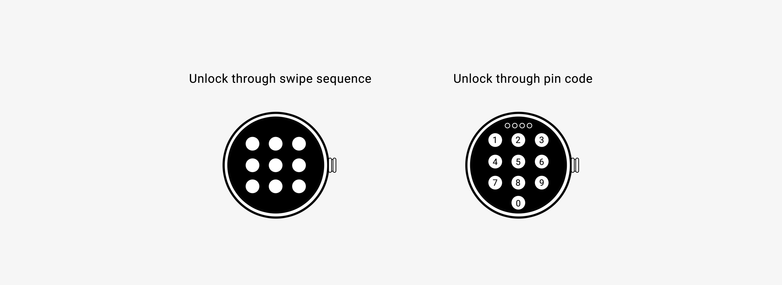
Based on this feedback, I've decided to make security a priority. The idea of having a verification method when using this product is something I'd like to explore. Also, I've also decided that there are three main categories that each function of this product fall into: a key (buildings, events, etc), an ID, and a way to make payments. These are the three things that I'm going to focus on along with a way to verify that you are correct user.
Here are some questions I still have:
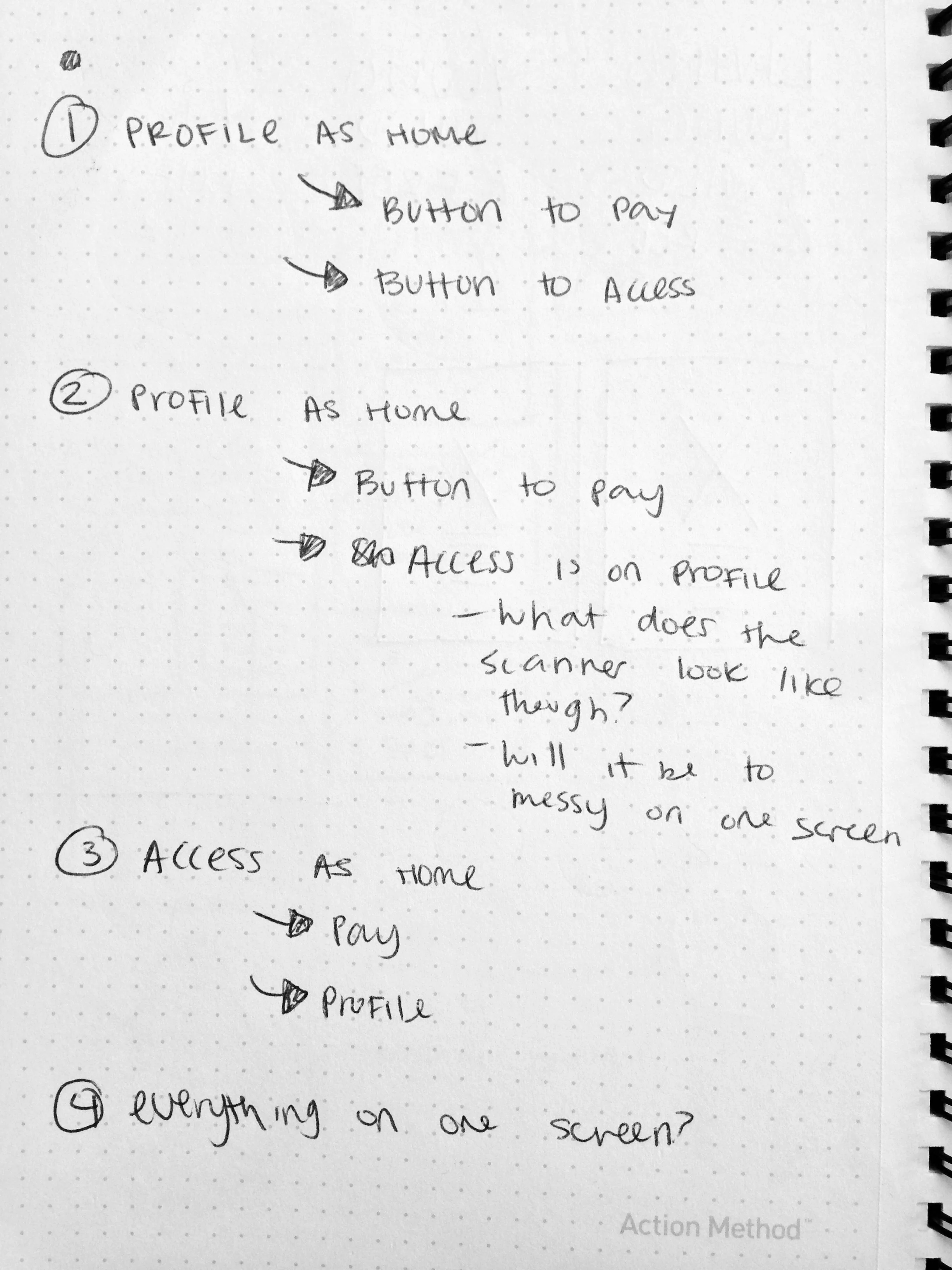
- What is the default/home screen?
- Should you have the option to select what you want to do? (I want to pay for this.)
- What is the flow for swiping your watch on a sensor? Should a confirmation screen come up?
- What is the flow for paying? How should you select what you want to pay with?
- How can the Android phone be utilized?
Here are some brainstorms of some of the flows and screens to clearly get my ideas out on paper.
I've decided that simplicity is what the goal is with this product. Here are some higher fidelity flows of possible solutions. I pretty much have the Home screen set. I just need to figure out what the flows of the Access and Payment features will be like. The access flow could be as simple as just a loading and confirmation flow so I will probably just do a quick survey of possible ideas with that. The payment flow needs to be tested so I will create a quick prototype to see how people interact with the ideas I had for that.
Low Fidelity Prototype and Usability Studies
I created a very basic prototype on InVision to test out some of the initial designs on the payment flow. You can view my prototype here: http://invis.io/MH2ERIYZC
After creating this prototype, I tested it on some volunteer students. Here's what I found out:
- Students want the quickest solution. A lot of comments I received were the appreciation of one way or another being faster or easier to see the choices.
- Abbreviations and icons weren't a favorite. Students want clear text and titles so the chance of error isn't too high, especially if it's something important like their money.
- There could be more than two methods of payment. What if students have other ways to pay, especially ones at other schools? Some of these solutions wouldn't work for that use case.
More Detailed Flow and Wireframe
After interviewing several people and watching some helpful videos and articles, I've made more decisions on where I want to go next. I've been really learning a lot from the Google I/O videos of designing for wearable technology. Here are some of the videos that have influenced my thoughts.
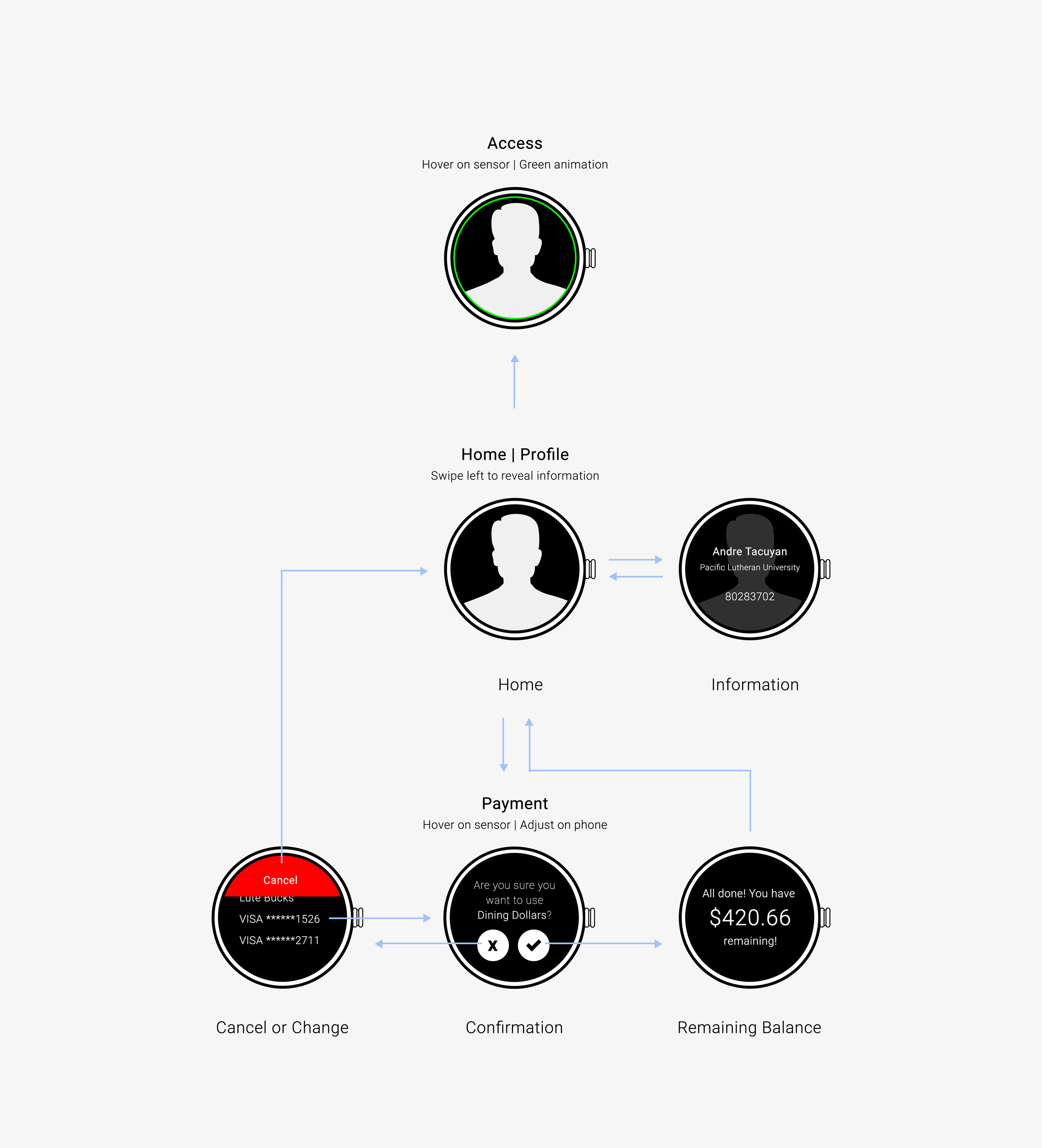
This is the final user flow that I've decided to go with. There are tradeoffs for certain areas of course. Let me go through in detail of each of the three features of this product.
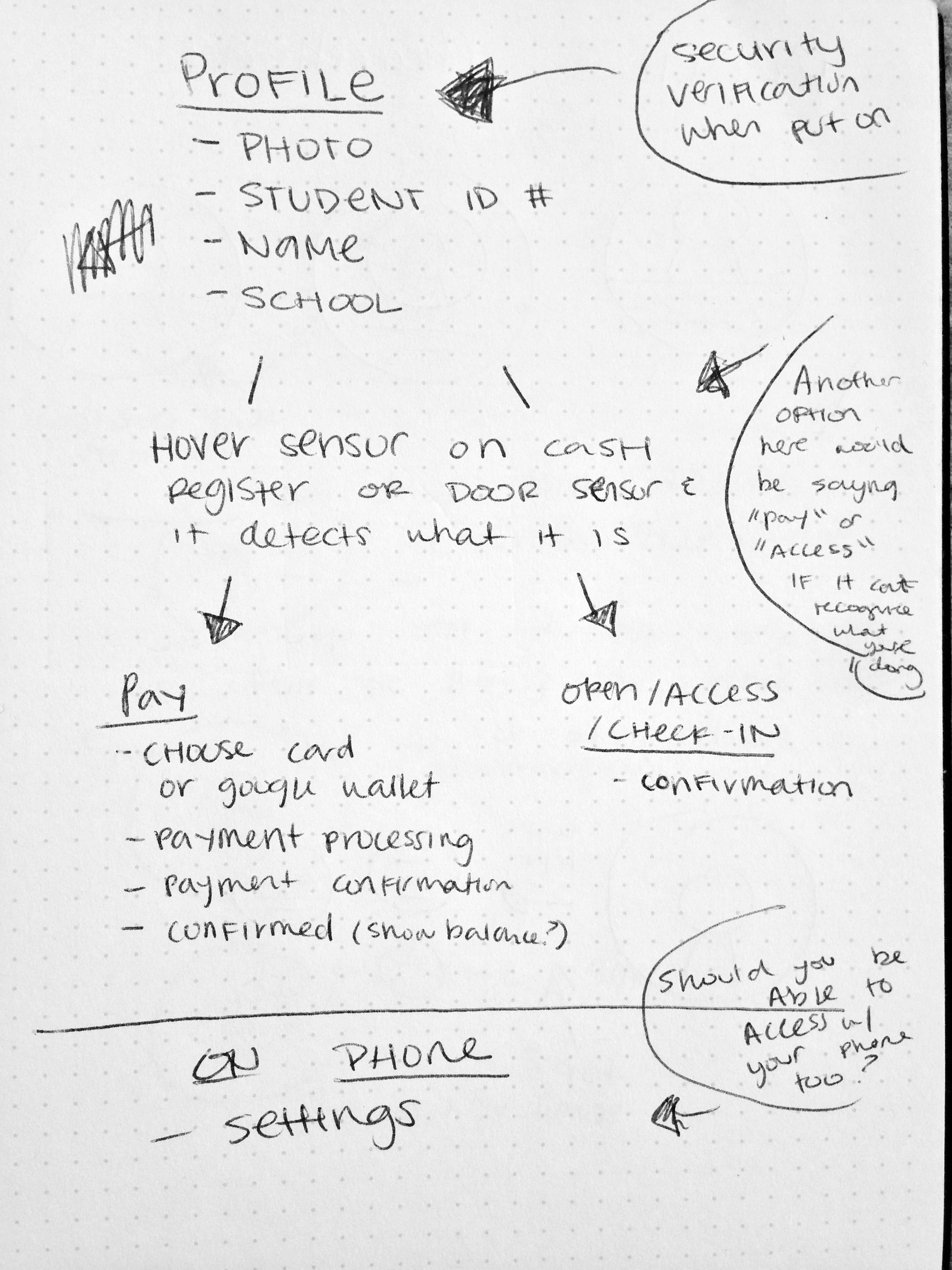
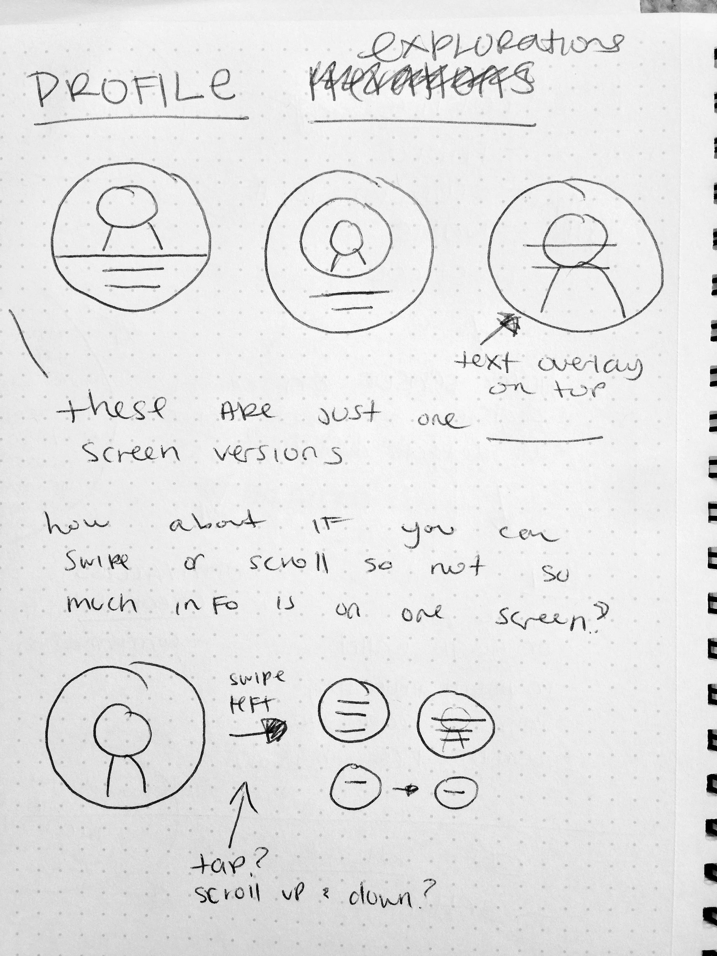
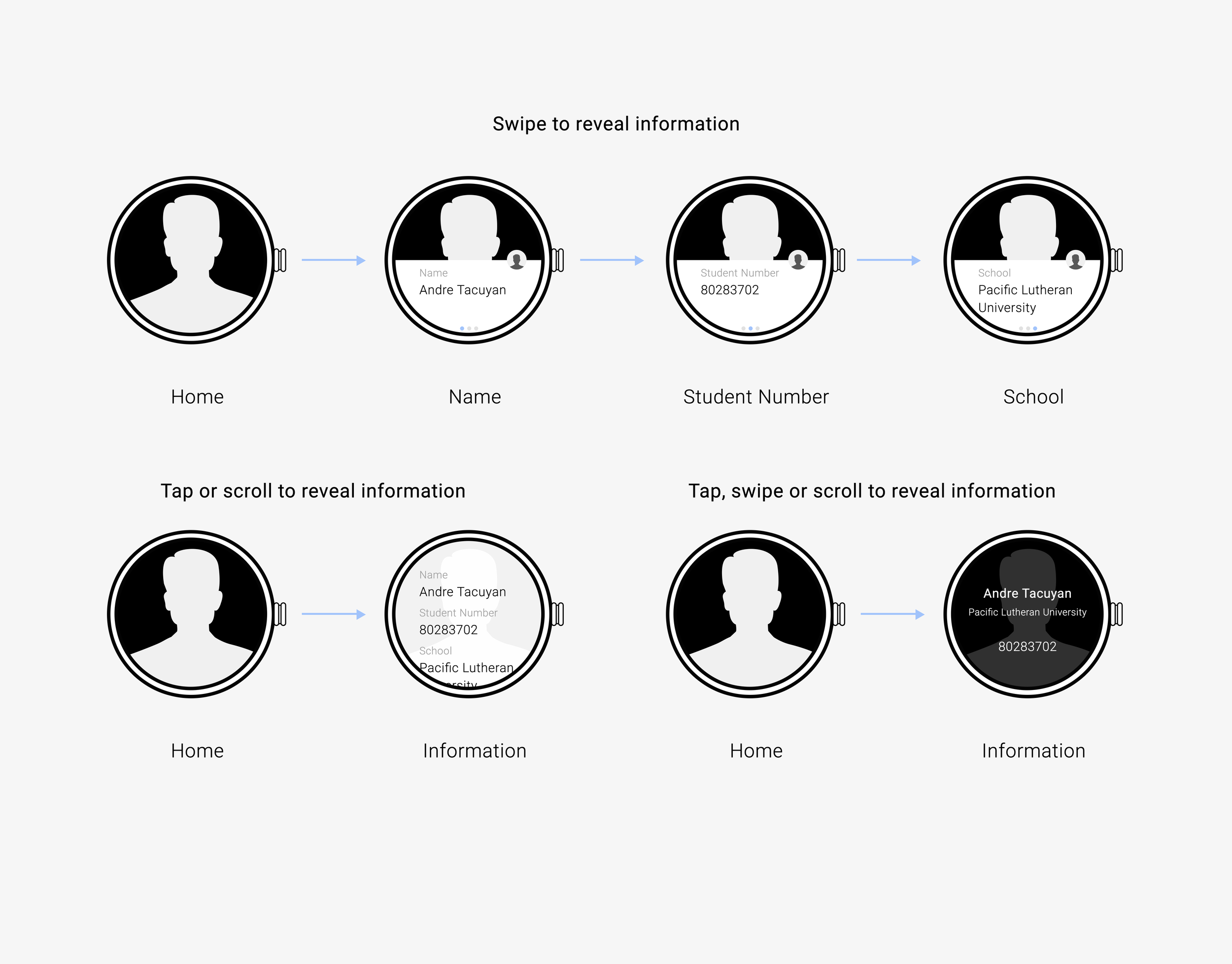
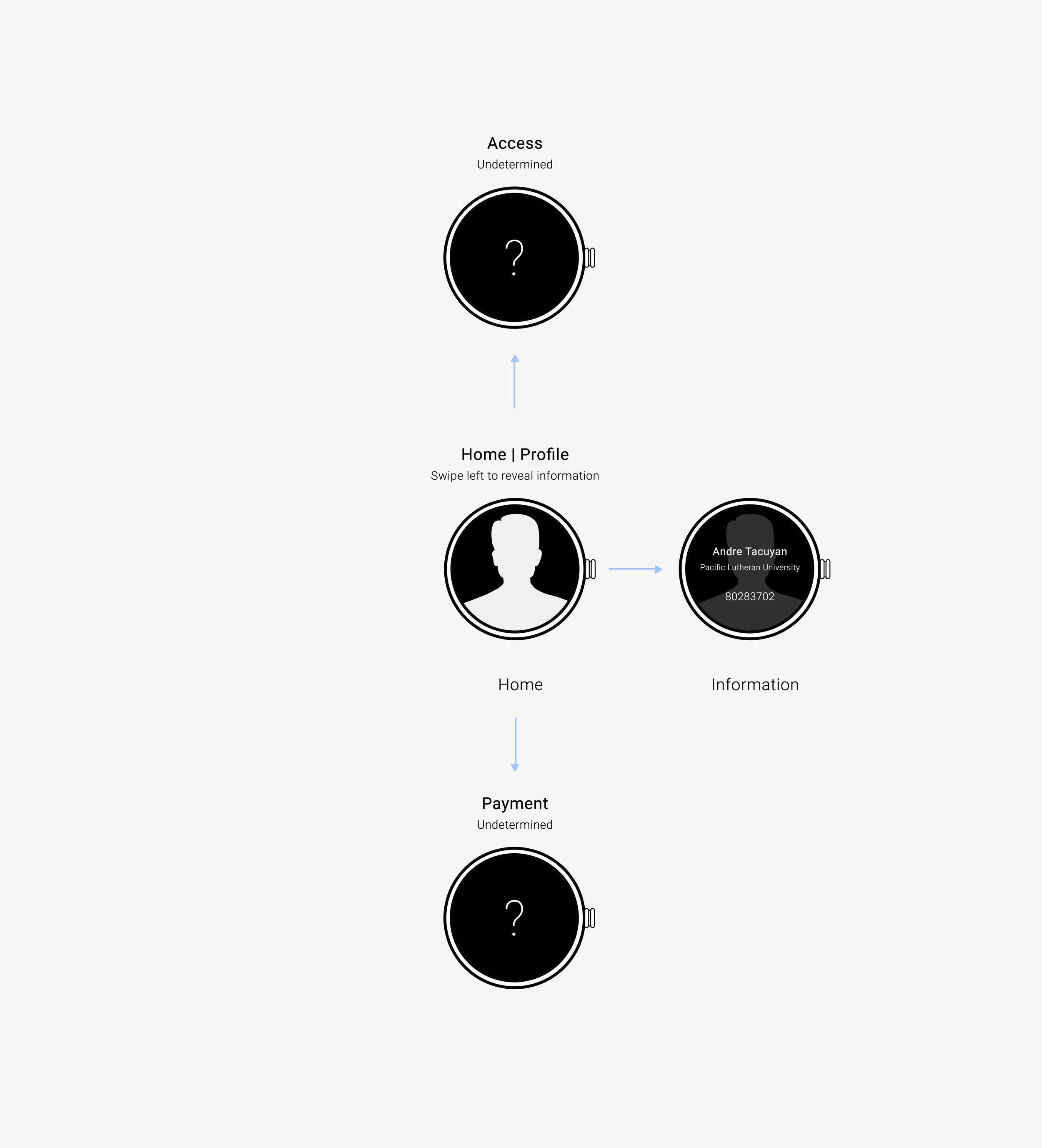
Identity/Profile
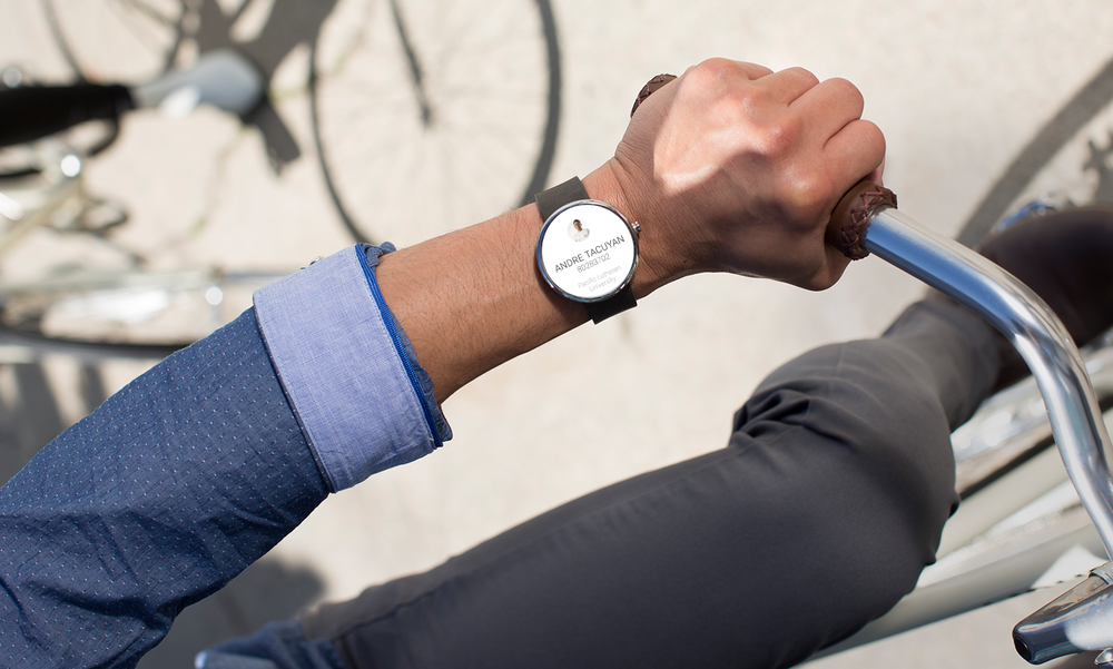
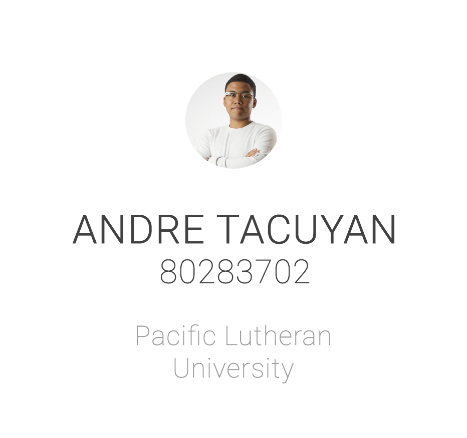
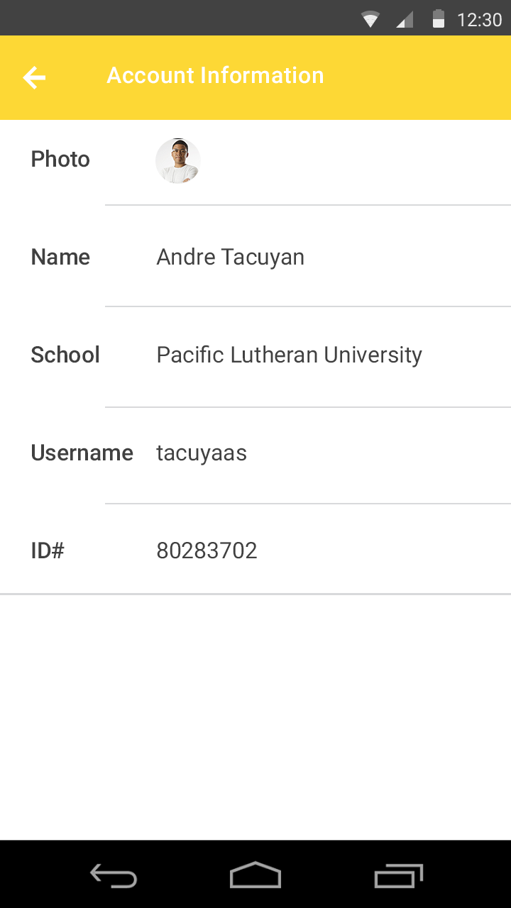
This is the default screen. The user's photo is displayed and upon a simple tap or swipe, the user's name, school, and ID Number is revealed. The same interaction can be used to hide this information.
Access
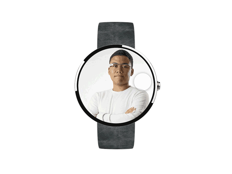
The digital key. College students are always using their ID card to get use resources at school like the printers in the library or enter into buildings like their own dorms. Instead of having to swipe their card, the user is able to hover their watch above the sensor and unlock anything they need or open the door to access the place they have to be at. If the user is successful, a simple, green animation will orbit their photo. If, for example, they don't have access into a building, the animation will be red and deny access to the user.
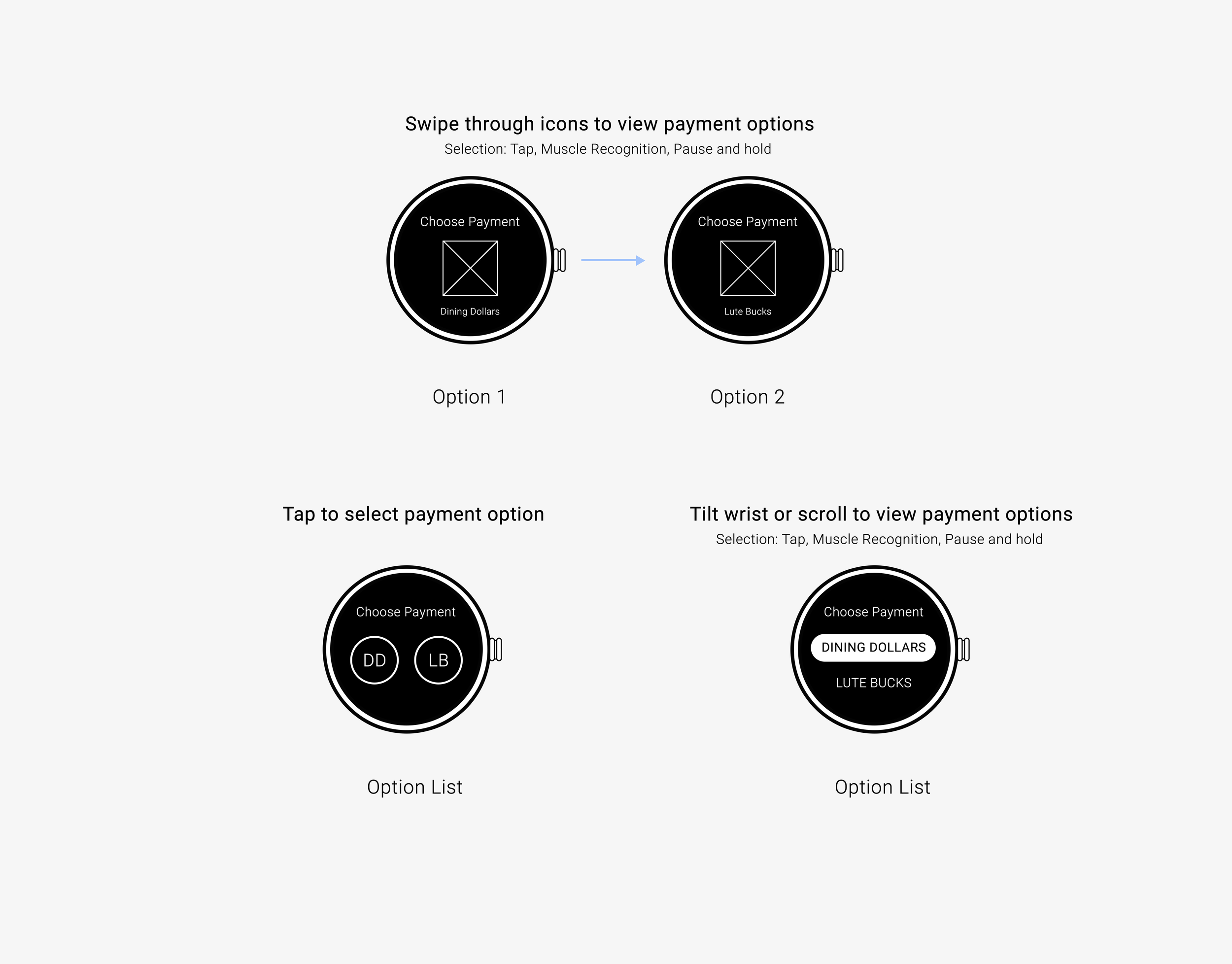
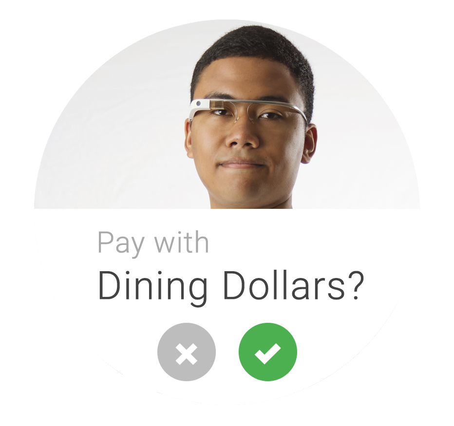
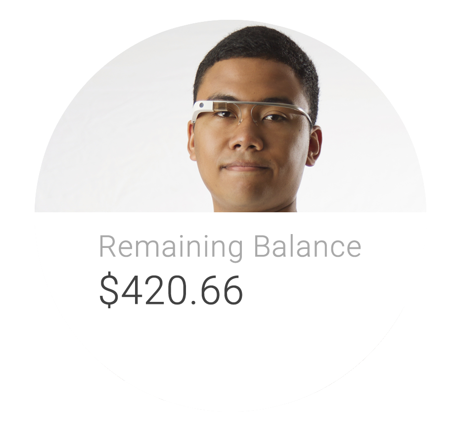
Payment
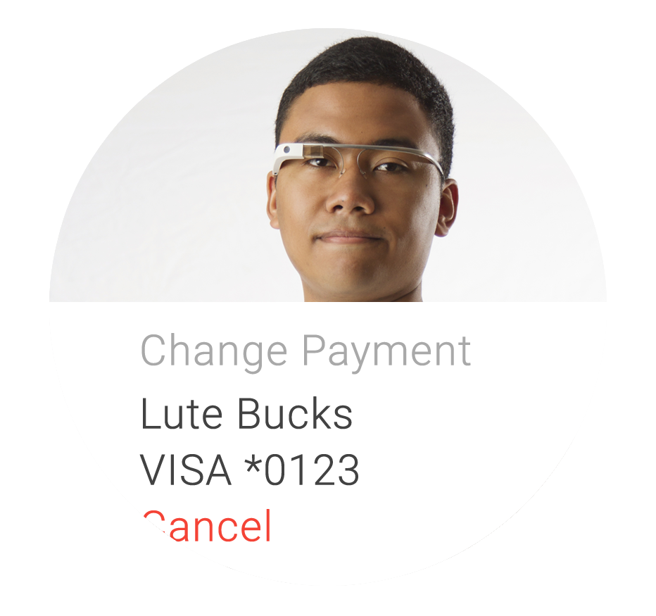
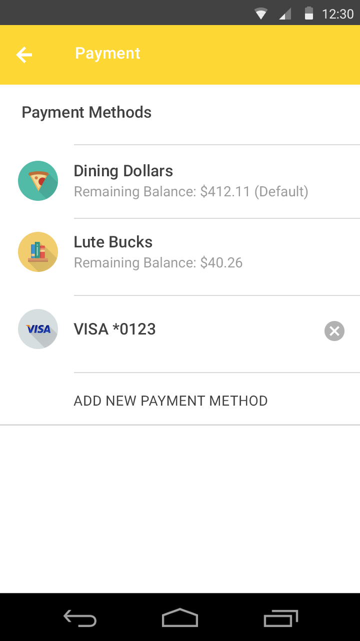
Payment was one of the biggest challenges of this product because of the many ways I could take this. Students are always on the go so this had to be as simple and quick as possible. The user is able to input payment methods on their phone as well as select a default method to use during each purchase. Using NFC or near field communication, the user simply hovers their watch over the sensor and is brought to a confirmation screen of payment. The user then approves this payment, otherwise they can either cancel or select another type of payment.
After figuring out the functionality of the product, I then created visual designs and created an interactive prototype on Framer.
Visual Design
Here are the high fidelity visual designs I came up with. These designs follow a very simple and straightforward design pattern. There doesn't need to be a lot of information displayed especially since this is on a very small watch interface. Material design elements are used throughout the design, for example the Roboto type choice. I'll be putting my final interactive prototype here soon so you can test it out yourself!

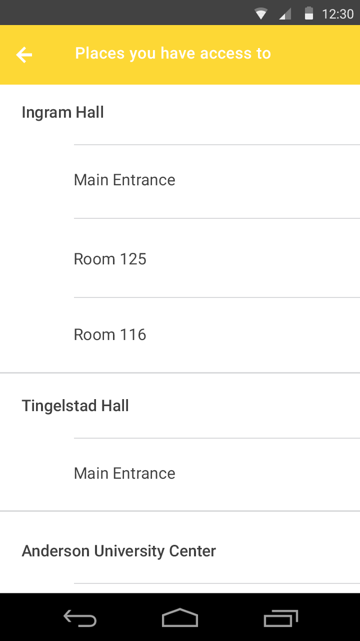
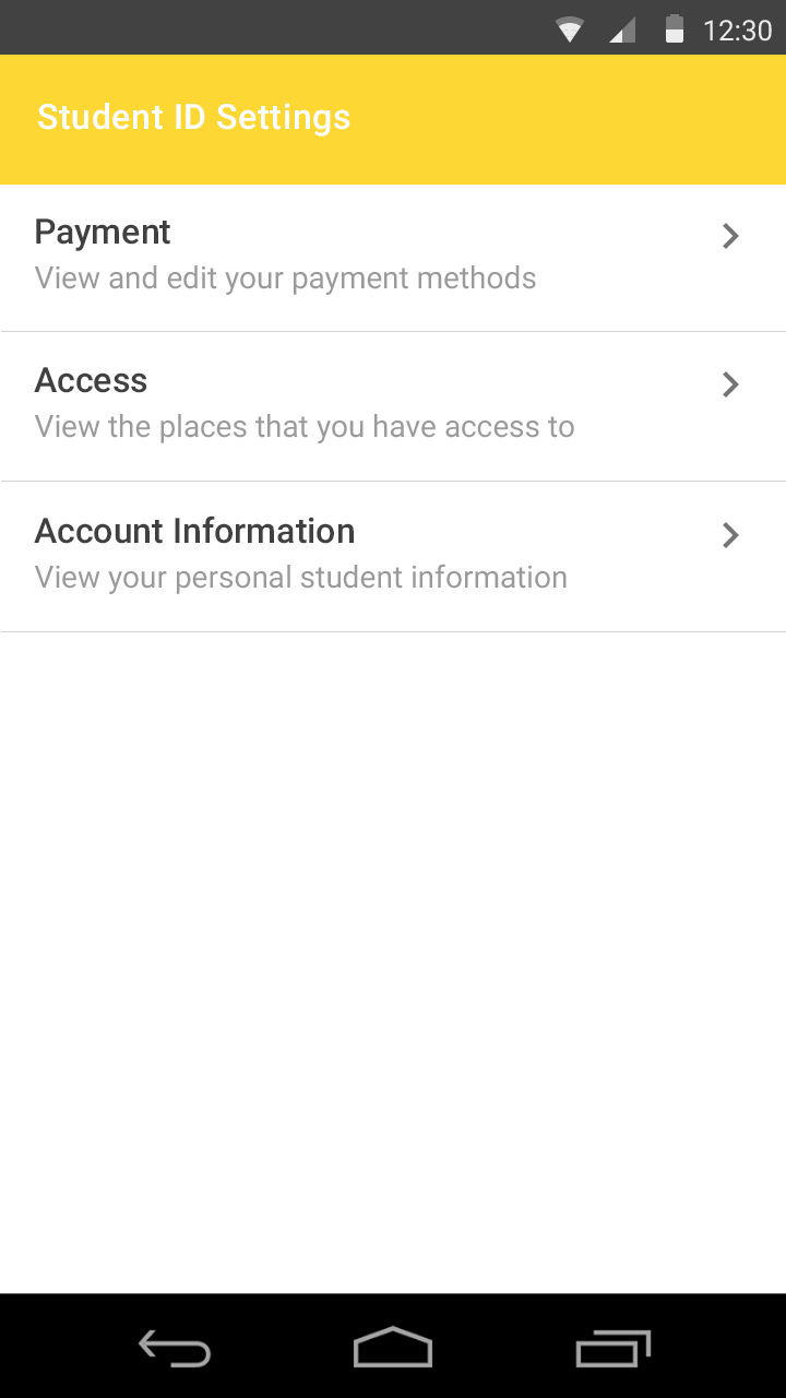
Here are the screens for the Settings feature, which can be accessed on the user's Android mobile device. Here, the user can view which buildings they have access to, view their student information, and edit their payment methods. The colors here will depends on the user's school colors.
Conclusion
This was my very first project I've designed for not only Android Wear but for a watch interface in general. It was a great learning experience and I've learned a lot! There's a lot of things to consider when designing for a new medium like this and this has made me even more excited for the future of smart watches, wearables devices, and technology in general. Moving forward, I'd like to test this on students around the country, get feedback, and iterate on that feedback. It's pretty awesome to imagine this being used at hundred of schools but for now, this was a great conceptual project and I'd like to work on more projects like it.