TLDR;
1. The problem
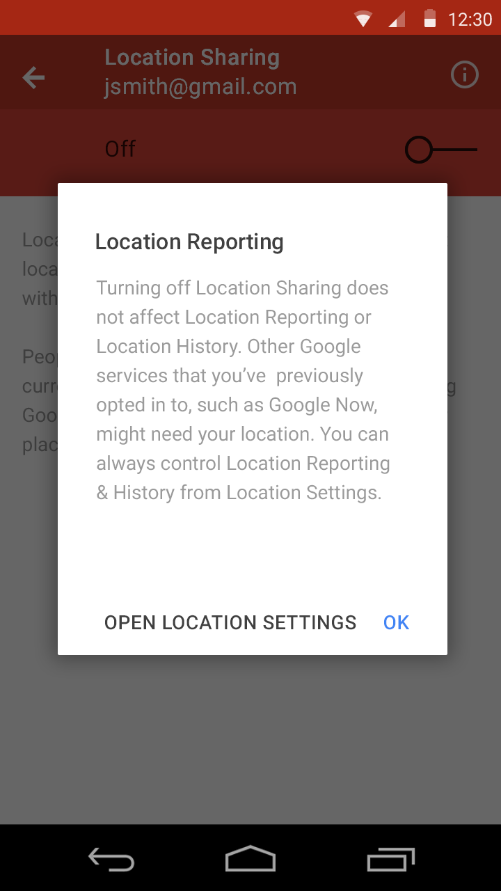
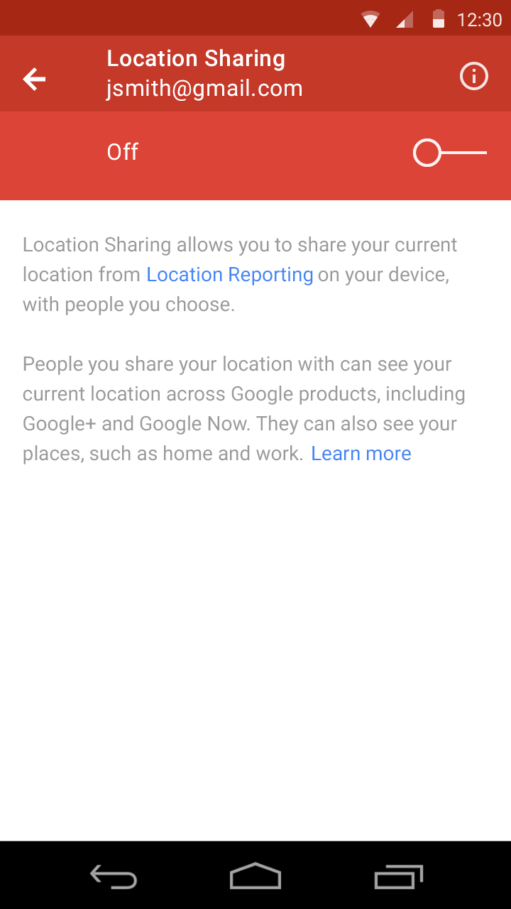
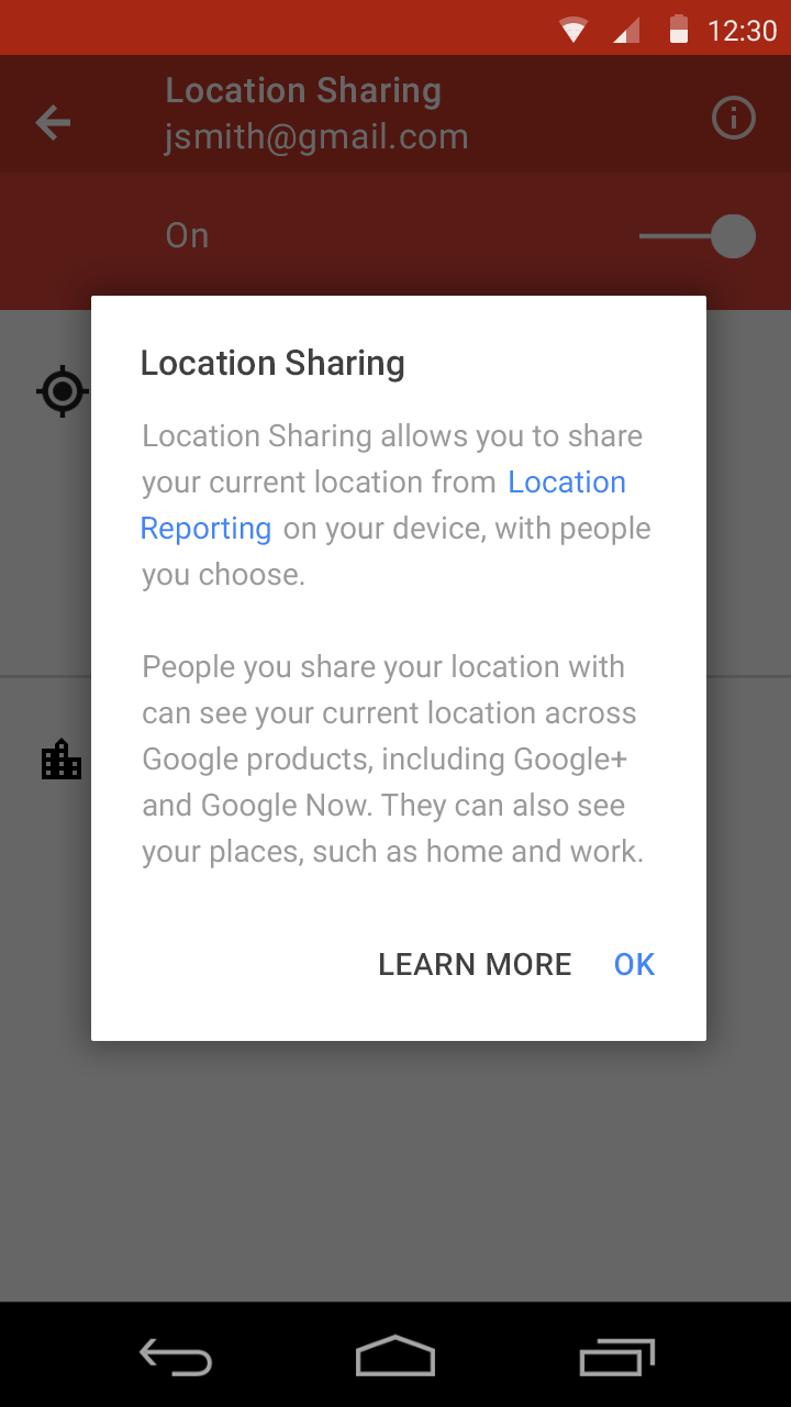
Location+ is a product that lets people share their real-time location with one another. Previous research has shown that the process of editing who people were sharing with was not simple. People didn't know what was being shared and who it was being shared with. My role was to design a more simple solution to the Android mobile app settings screen to make it more intuitive as well as to update it to the Material Design spec.
2. Who I worked with
I was the sole designer on this project with guidance from my manager. I worked with PMs, engineers, and my manager. We had meetings about once or twice a week where we brainstormed, critiqued, and collaborated on making sure this product was being designed perfectly.
3. Product goals
For this product to be successful, it had to be simple and intuitive. Users should easily understand what settings they are messing with and what they are exactly doing. Location and privacy are a big deal to people so this had to give them full control. I would say it was successful because there was great feedback from the usability studies. I'm interested to see how it's doing in the real world now!
4. What I learned
This was the first project that I actually conducted official usability studies on. I came into Google not knowing much about research and was able to really learn about it through this project. Moving forward, I'd really like to do more usability studies on the newer iterations. I'd like to see if I actually simplified the process and made people more aware of what they were editing in the settings!
Research and Explorations
I started out by understanding the product and figuring out the audience. The target was people who cared about their location and have the Google+ app. I conducted a Google Consumer Survey though to see if there were any patterns. Research showed that there was no specific pattern. Different people were comfortable sharing their location whether they lived on the east coast, if they were a female, or if they were under the age of 25. I started using the Location product myself and wrote notes about what I thought was wrong with it or what could be improved.
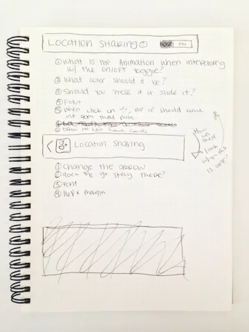
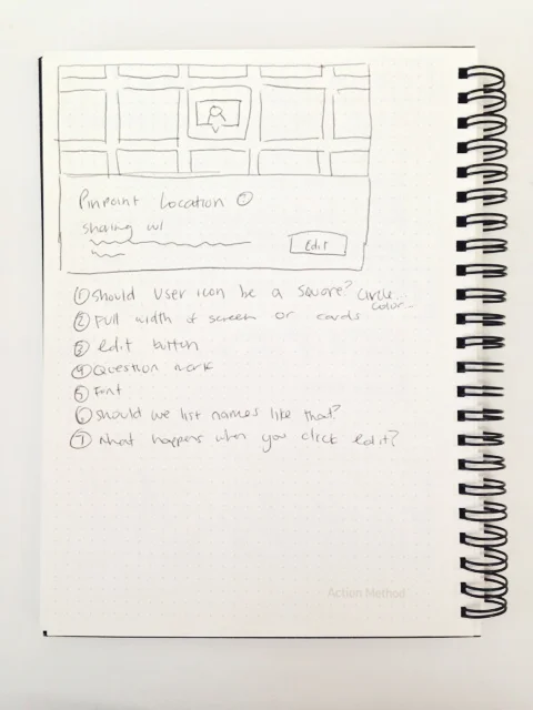
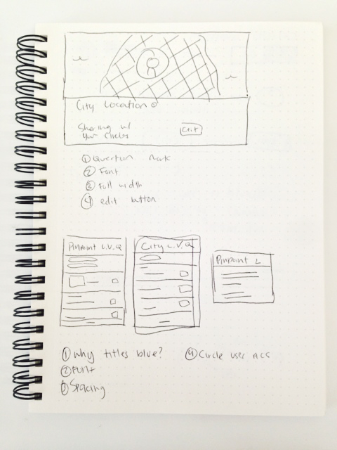
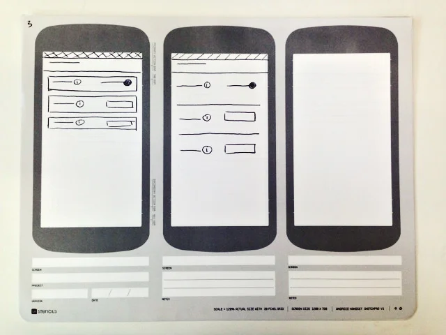
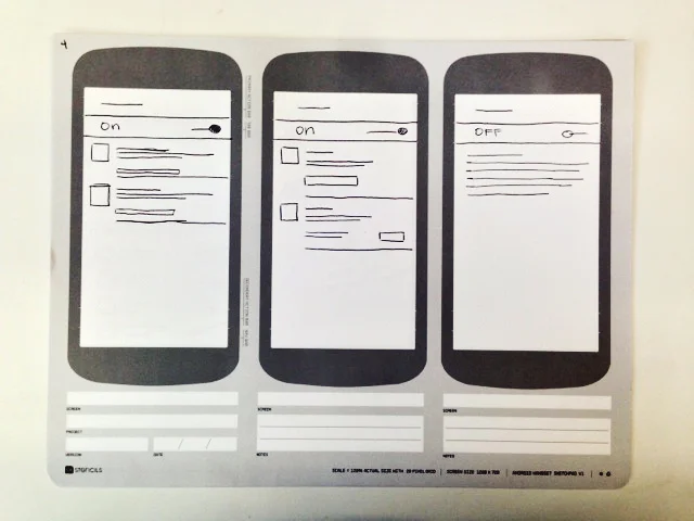
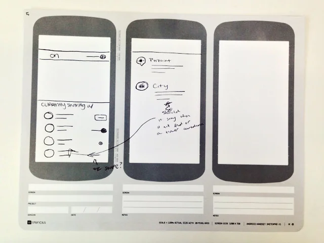
I began with sketches. So. many. sketches. I threw out any ideas I had. How should users be shown on the map? What should the map look like? Should there even be a map? These are some questions that were going through my head as I hashed out ideas. Here are some of the sketches I made!
Wireframes and Iteration #1
After making some decisions based on research and assumptions, I came up with a simple flow and a visual refresh of the product. My manager, Christian, was really happy with the product. I met with the engineers and they thought it was great as well! But then... the team discovered a global settings pattern that was being used on other Google products. Well we didn't want to be the outlier so we didn't start entirely from scratch, but we had to change a few things just to stay consistent with the updated Material Design-based settings. Back to the drawing board!
Iteration #2
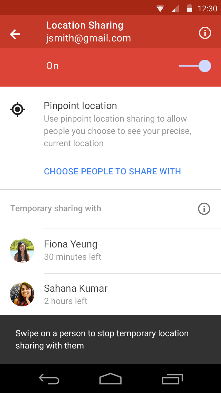
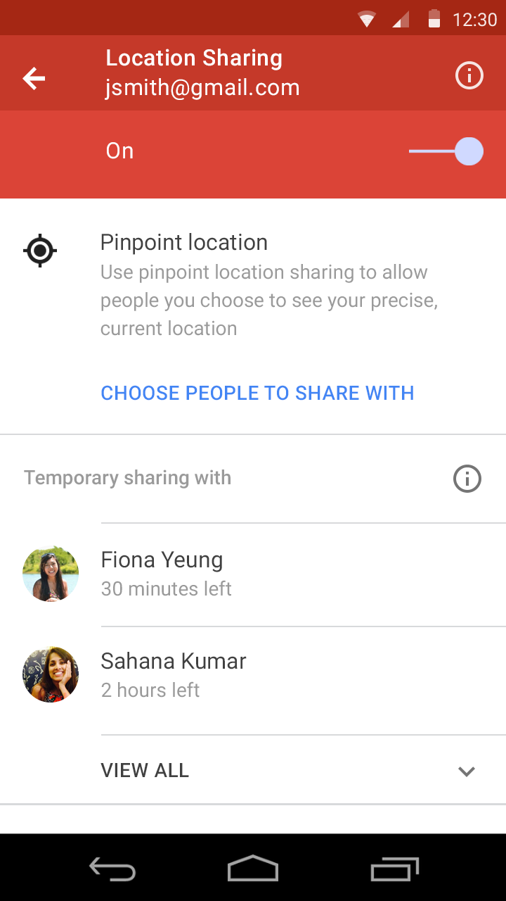
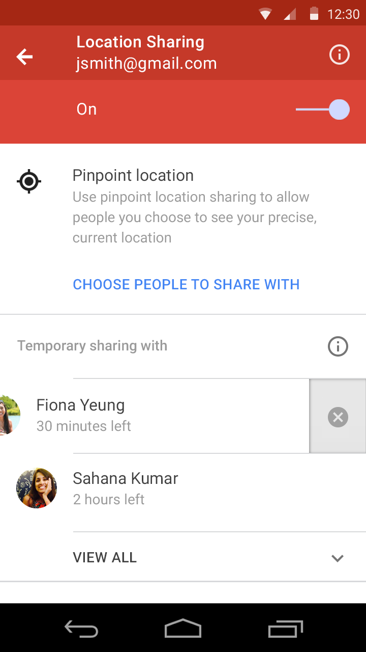
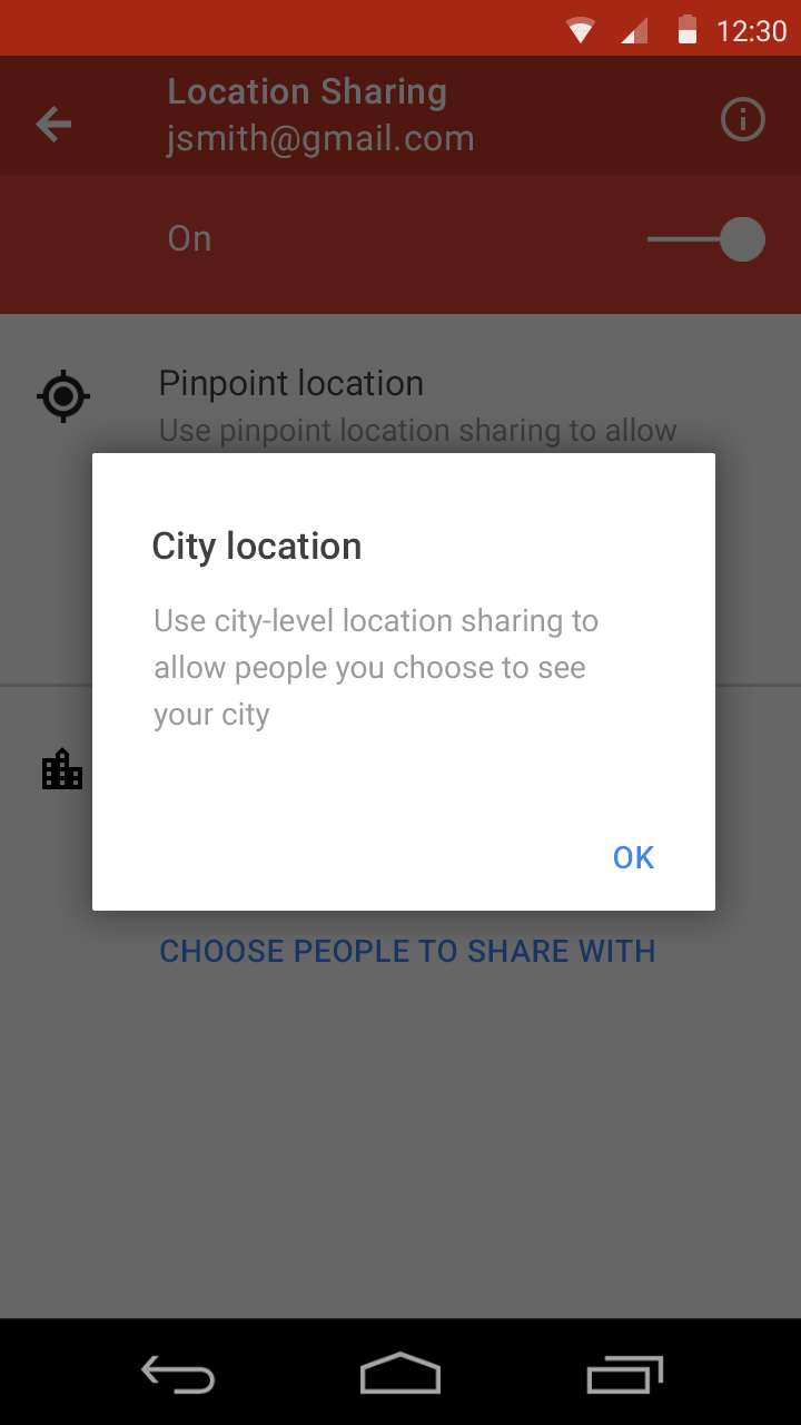
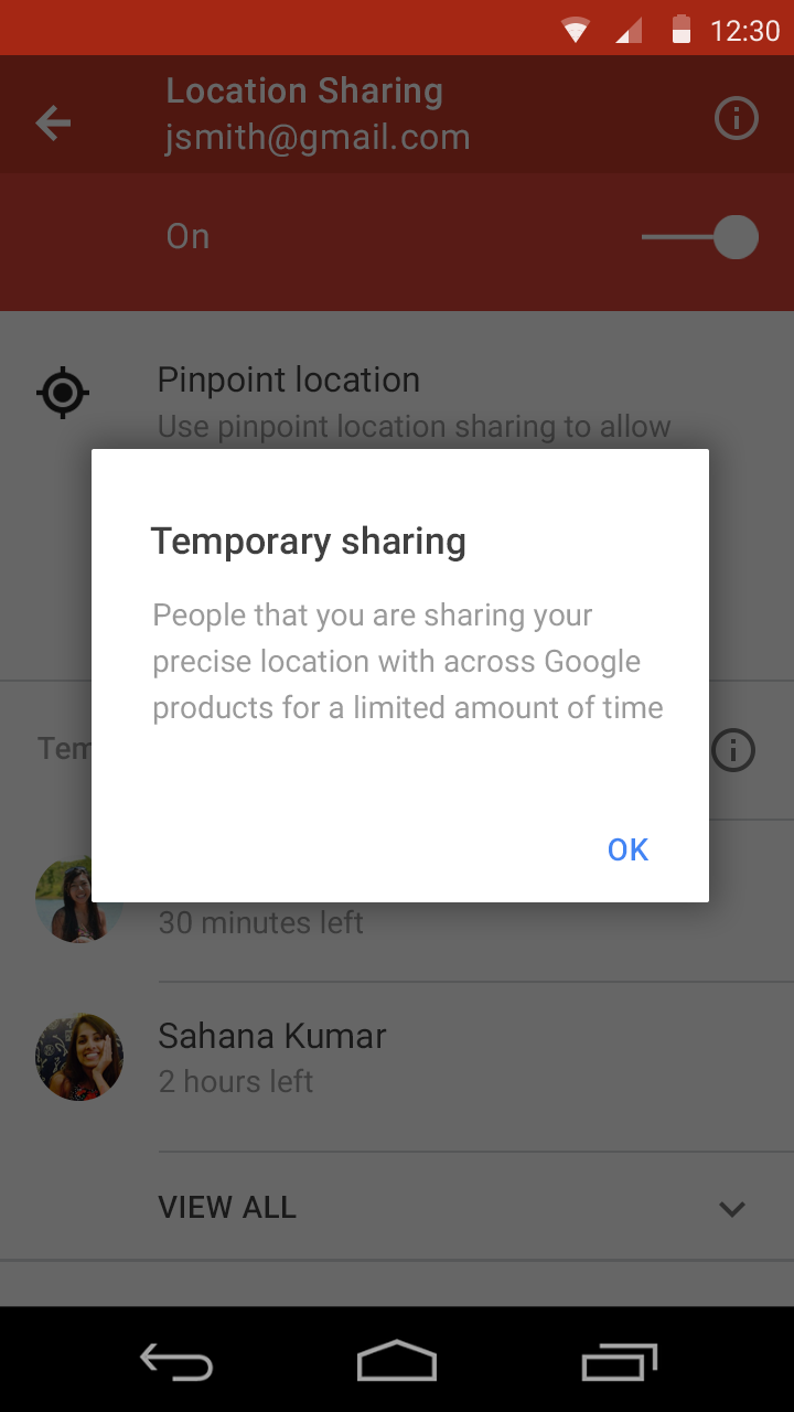
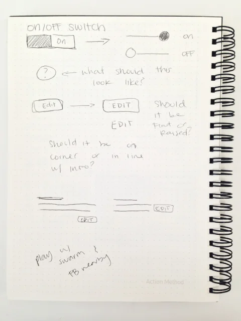
I took another stab at this but with the Google global settings pattern in mind. I can't show that right now but I can show you what I designed next. Oh, and around this time a new feature was introduced after talking with the team: Temporary Sharing! This brought on new challenges and decisions to make! Where should this even belong? What are some use cases of it? How can we add this into the design without making it look so cluttered? Here are some explorations on these new constraints:
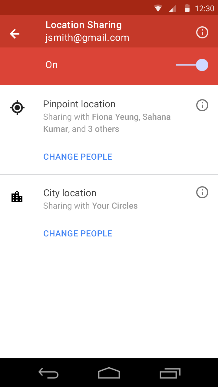
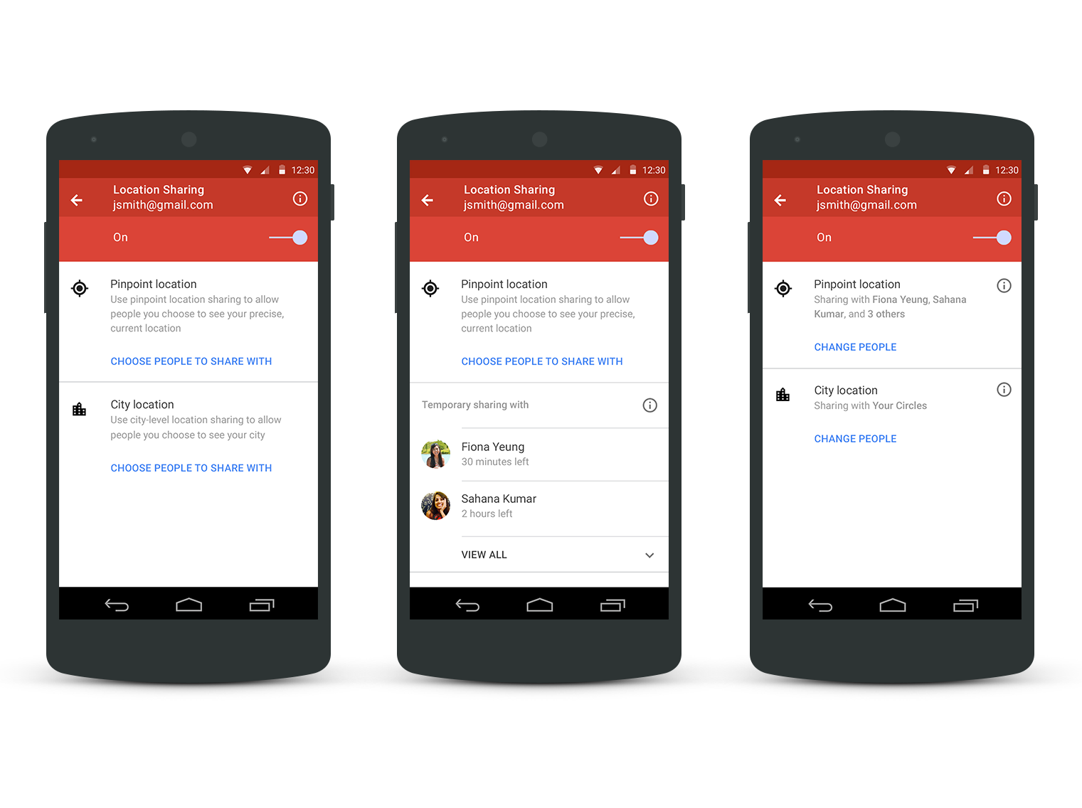
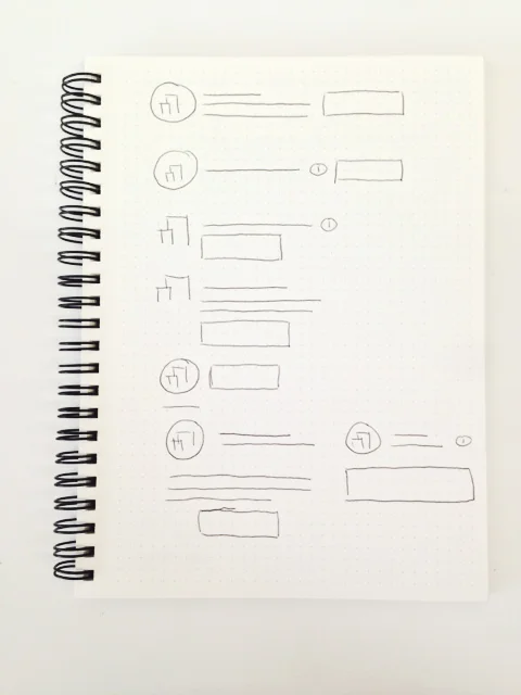
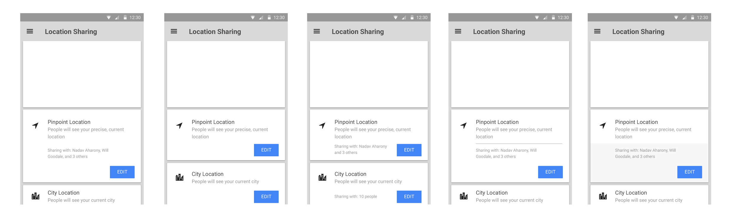
As you can see, I played around with the headers, the placement, the colors, the spacing, and many other things as well! In the end, I chose the design in the middle. There were definitely some tradeoffs for my decisions. Temporary sharing was only used for Pinpoint Location sharing so I thought it made the most sense to have it under Pinpoint instead of under City Location sharing. This caused City sharing to be buried under Temporary sharing though but it made the most sense. I also had to make some hierarchical decisions like the Temporary Sharing title.
Usability Studies
This was the first time I conducted official usability studies on a product so I was extremely excited for this!! I worked closely with a researcher on our team, Whit Schrader on this. We brought in eight random people to try out this product. My manager, Christian, and I wrote a script and some questions we wanted the people to answer. Whit was the one that sat down with these people and asked them questions and walked them through the product. I watched this happen on a live streamed video in a different room and I thought it was the coolest thing ever! People reacted differently than I thought! After, Whit created a report on his findings and overall, it was pretty positive feedback! I still had some things to change though.
Conclusion
After making some small changes based on the feedback (e.g. master switch color change), I was finally done! I redlined the mockups and worked with the engineers to make the final adjustments. I was able to present this project to the whole Social Product Area! This was one of my biggest goals of the summer and I did it!
It finally released!! As of October 8th, I have officially created a product that was launched by Google! You can check it out on the Google+ Android App by clicking on "Location"! Go check it out!
Here are some of the final high fidelity designs! Thanks so much everyone!