An app to browse, search, and discover new content by Olympia Entertainment Group.
TLDR;
1. The problem & exercise
Olympia Entertainment Group is an entertainment company that includes divisions in film, television, interactive, and owns a cable network. The client is looking to create a modern, beautiful, and easy to use app that presents personalization and incentive options encompassing all the ways a user can engage with elected or unique media. To start things off, I will be focusing on one feature: Search and Browse.
2. Product goals
Success is defined by how well a user can engage with set business goals. Specifically, this feature needs to discern and intuitively serve the user by providing a
Clear distinction between function of search vs. browse
Clear distinction between applicable categories
Clear distinction of how different content types are handled
Surface content that takes into account the user preferences
Surface content that encourages engagement with relative-to-user content
Brainstorming and Research
When starting a project, I typically like to do my due diligence by researching and making sure I understand the domain I’m working in. Since this was a quick exercise, I decided to not spend too much time on initial research. I quickly took a look at Search and Browse features on similar products I was pretty familiar with, YouTube and Netflix.
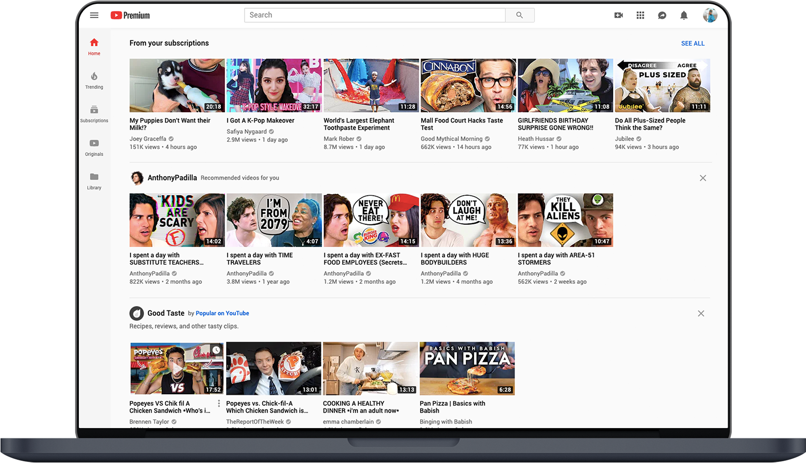
YouTube
1. Clear distinction between what’s popular vs. what’s new vs. what is based on user’s preferences.
2. Search vs. Browse experiences are very different. User must explicitly type something into search bar to get taken to the Search flow.
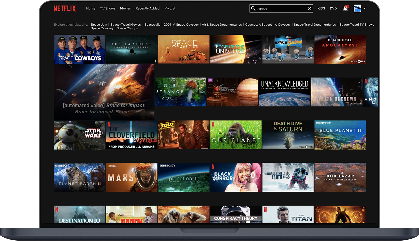
Netflix
1. Hovering over thumbnail expands and plays trailer causing user to be more engaged with content.
2. Very bad distinction between content types. Which ones are movies? Which ones are tv shows?
Deciding the App Direction
Typically, after research and brainstorming, I like to chat with fellow designers, engineers, the client, and any stakeholders to make sure we are all aligned and have a clear vision for the outcome of this project. I try to make sure all the right questions are asked but for the sake of this exercise, I went ahead and made assumptions to these questions based on research, experience, and common sense. This is also based on my own personal preference as well. :)
Initial questions:
Who is the target user?
For this project, we are going to assume Olympia Entertainment is not a popular platform among young people (app is dated). The user is a fan of traditional entertainment (cable tv) over new channels (YouTube & Netflix). We can assume they are a bit older, but not so old that they don’t understand how to use technology. We can also assume that they have a smartphone and understand common interaction and visual patterns. They have used this app before so they will appreciate a modern refresh but they will need a bit more hand-holding than usual.
What platform does this experience live on?
The email states that they have an iOS and Android app so we can assume this will be used as a smartphone app. Olympia probably allocates resources to their TV and web platforms which is why they are coming to us to bring their smartphone apps up to speed. For this exercise, I’d like to focus on a tablet experience. I know a lot of people, myself included, watch content on smaller smartphones but if we’re targeting an older user, they probably would prefer to watch on a larger form factor. The design should be easily scalable though.
What kinds of engagement are we expecting from users? What functionality does this provide?
We can assume that Olympia is offering features similar to other platforms, specifically watching, reviewing, and scheduling future content to watch.
I then created a user persona based on my assumptions:
Blake is your average, middle-aged woman looking for a way to wind down after a long day at work. She has some favorite tv shows she typically watches, but also loves discovering new movies. She needs a way to easily browse her favorite content but also search for new content based on her history and preferences.

Wireframes
Since I only had a short amount of time to do this project, I made a quick decision based on the research and decided on a direction to go for. I would usually create a user flow or information hierarchy but the feature was pretty straightforward and didn’t have too much levels so to save time, I went straight into the wireframe and mockups.
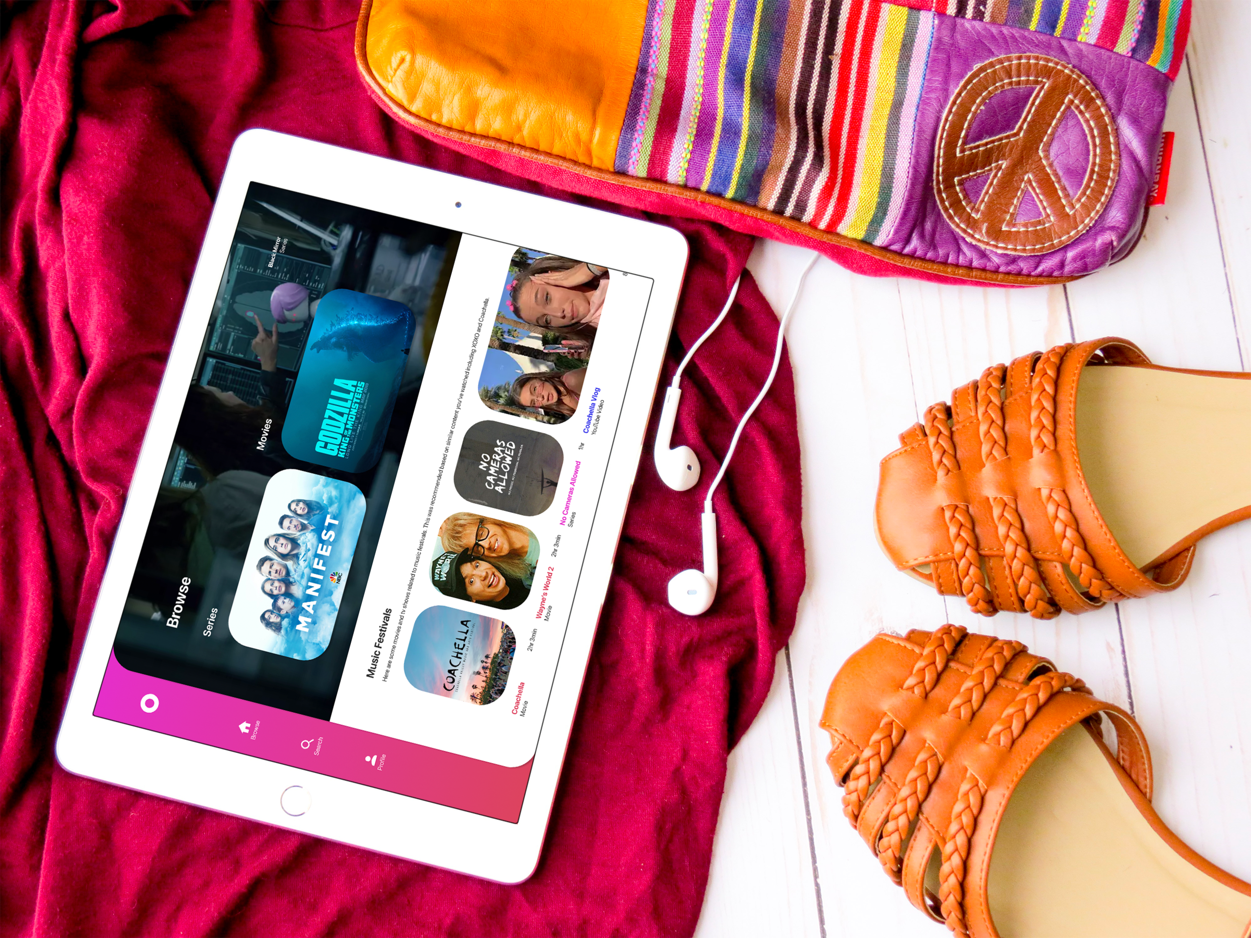
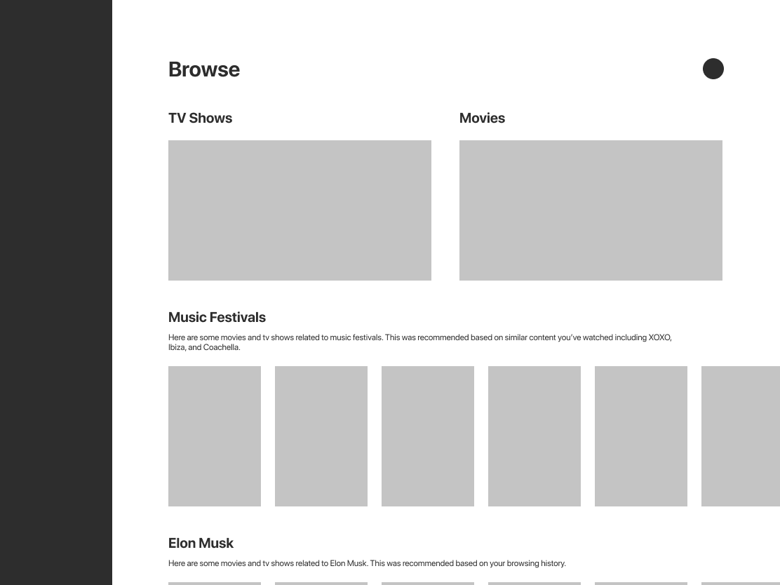
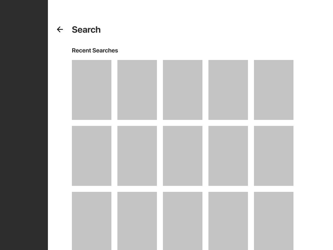
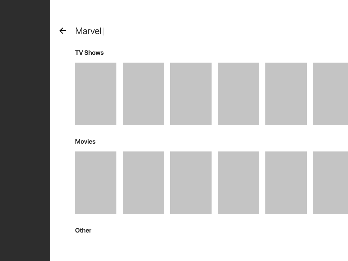
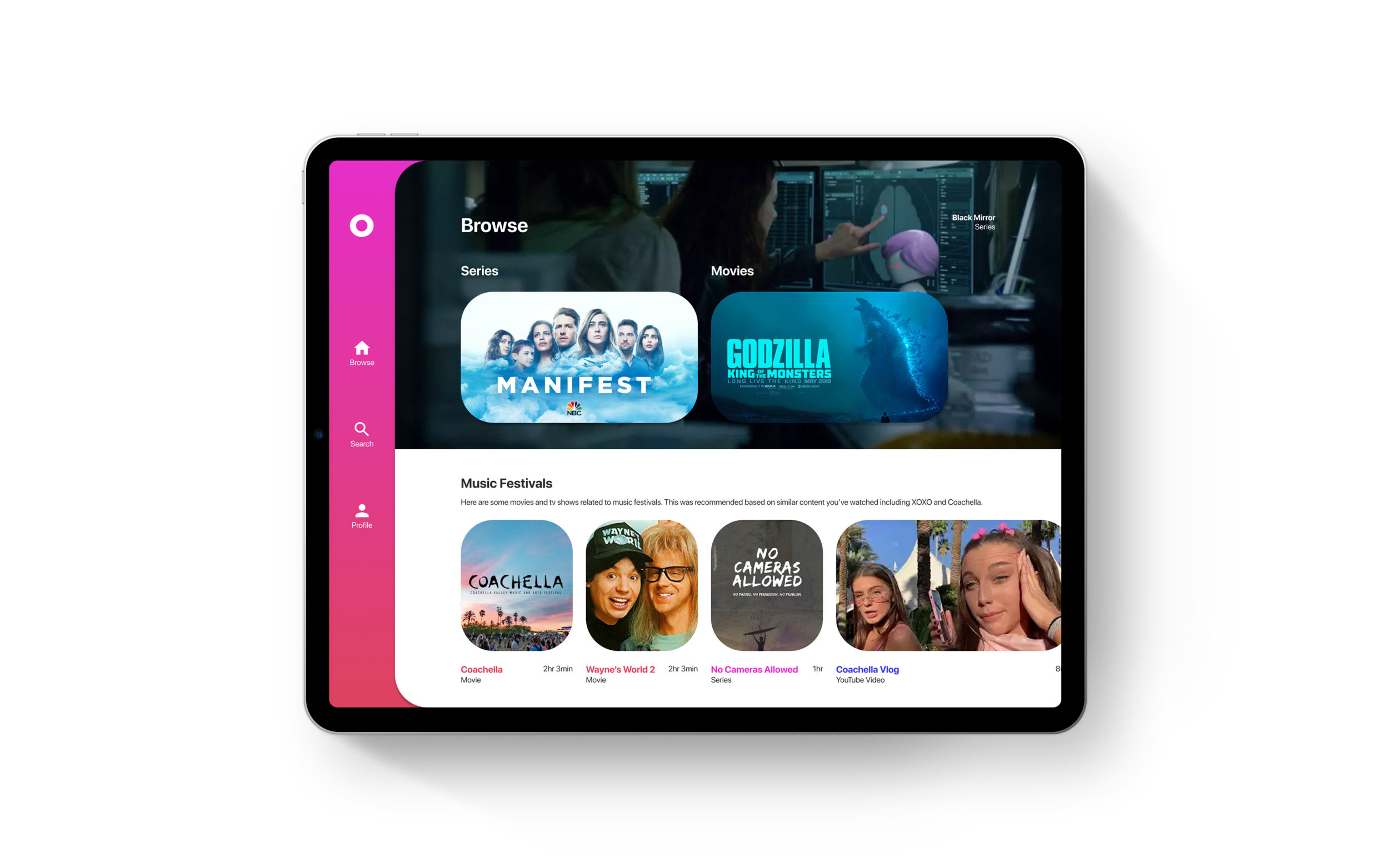
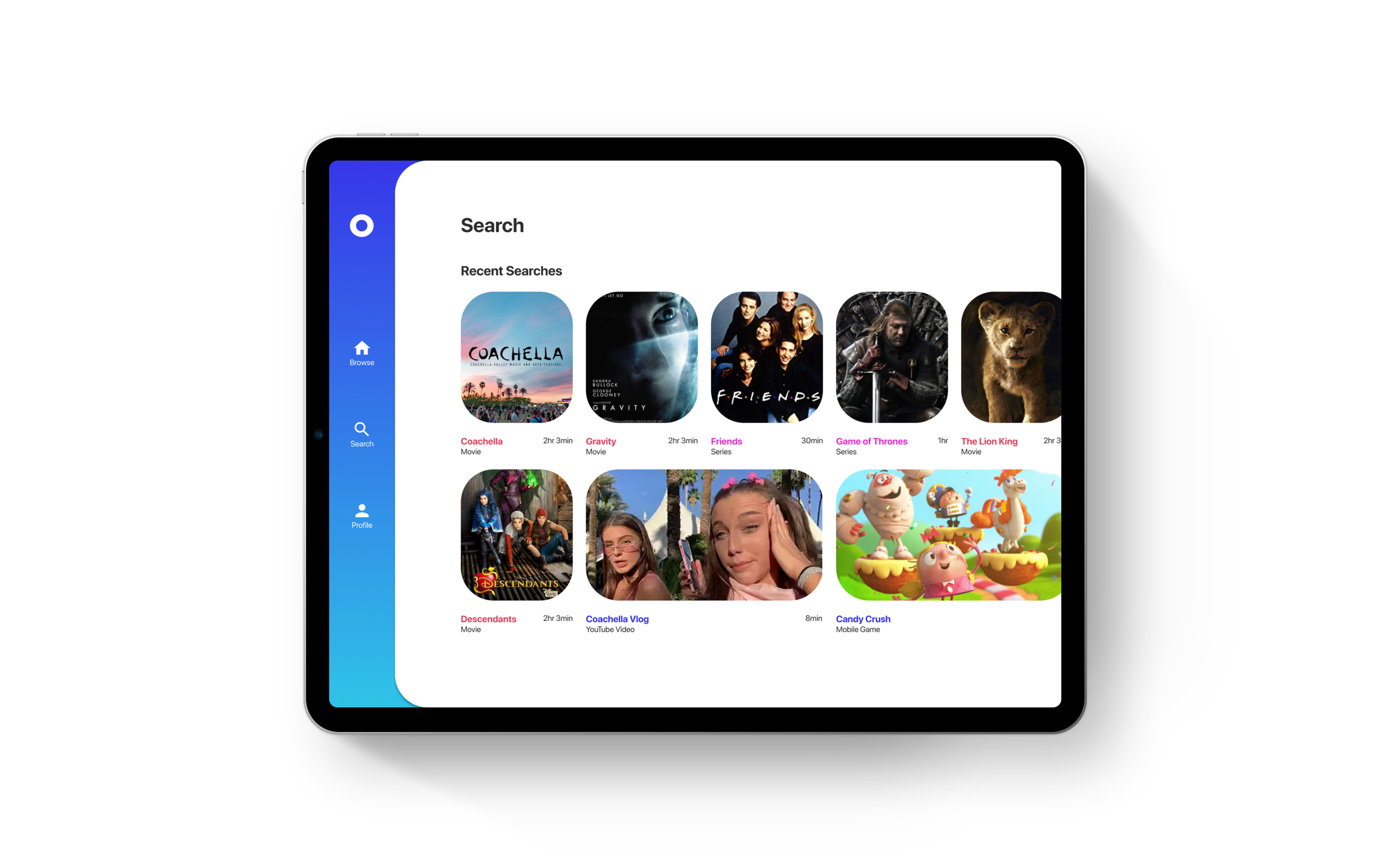
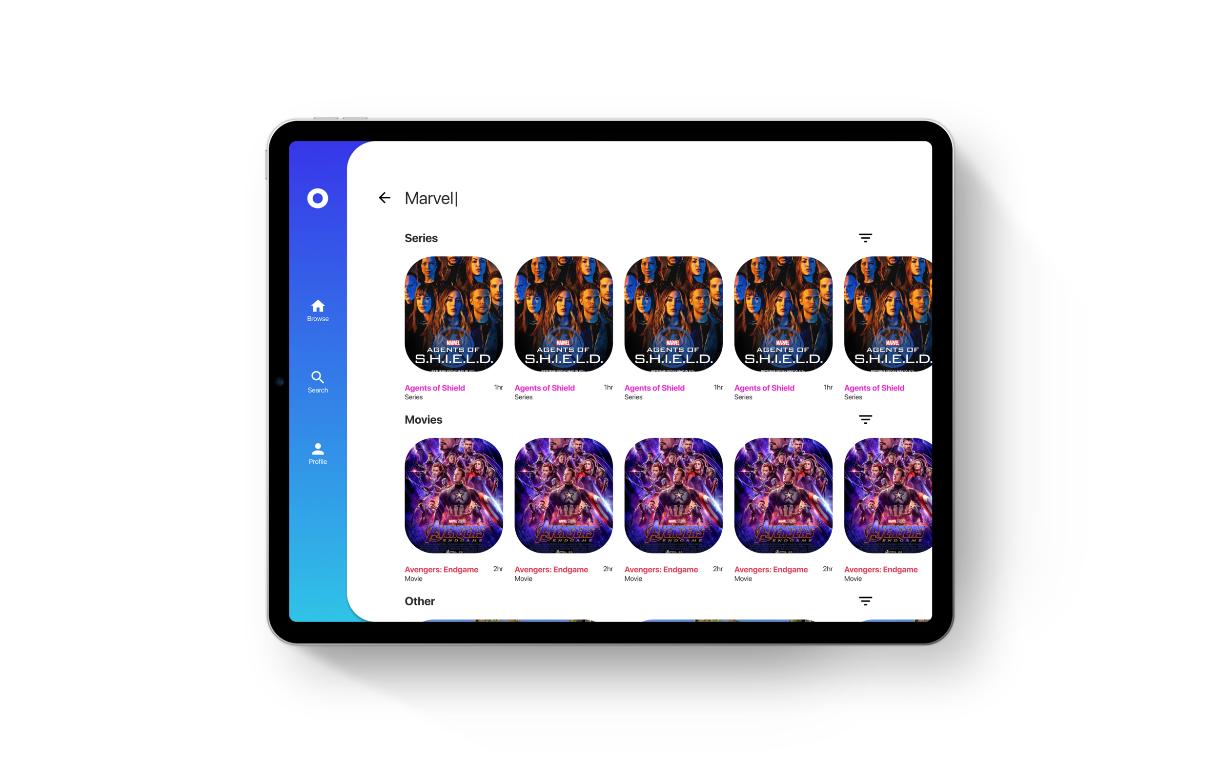
Since my target was pretty tech savvy but not the most up to date, I went for a pretty traditional design. The user is presented with 2 high level categories: TV Shows and Movies. Scrolling, they are able to see content based on their preferences and activity. When the user taps on the Search icon on the upper right hand corner, the user is presented with their recent searches. As they type in their query, relevant content is shown separated into the two categories for easy browsing. I also wanted to introduce this audience to new content types such as YouTube videos and Games.
Visual Language and User Story
Blake opens the Olympia iPad app to get welcomed with a simple splash screen showcasing the Olympia logo. The app has a clean, but vibrant look filled with gradients mirroring the branding of the client and the style of the email.
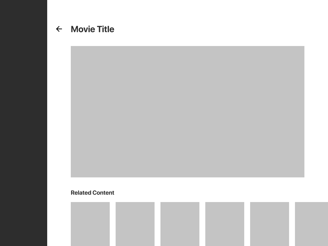
On the left, a simple navigation bar shows three tabs: Browse, Search, and Profile. The color of the bar on the left changes depending on where she is in the app. On Browse, she can tap on Series or Movies to browse titles by content type. If she scrolls, she’ll find various recommended categories based on her preferences and browsing history. Series and Movies are not only differentiated with the label under the title, but by the color of the title itself. Movies are red, Series are pink, and other kinds of content are blue. I wanted to introduce users to other forms of content besides just movies and tv series, so I including things like YouTube videos and games, depending on the user. This encourages engagement by giving the user a sense of curiosity as to why these things were recommended leading them to seek and discover new types of content. When searching, the user will be able to see their recent searches until they actually type their search query. They can then tap on the filter button and filter by popularity, release date, etc.
Conclusion
Moving forward, I’m pretty happy with how this project turned out but something that I would of liked to do more of is to try more risks. This is a clean design and very intuitive but what exactly are we doing differently from competitors? I would love to brainstorm with any stakeholders involved and talk through new, creative ways we can solve these problem.s I’d also like to explore all use cases with other personas. How could this work for children? How about for power users who already have seen almost all series and movies already? How can we make them discover more content and engage more with the platform?
In conclusion, lower fidelity explorations, more risks, and usability studies would help elevate this project to the next level. :)