Yabbly Desktop Profile Redesign
I interned at Yabbly in the Spring of 2014. It was such a great experience working at a small startup! I was able to work on some big projects and was able to explore and carry out ideas I had without going through much of a company hierarchy. Yabbly's mission is to enhance how people share knowledge through conversations on our "ask me anything" social interviewing platform.
Research and Sketches
One of my projects was to redesign the user profile. Some things I had to initially think about before sketching: "What are competitors doing with their profiles?" "What information is the user looking for when they look at someone's profile? What about their own profile?" "What are we lacking?"
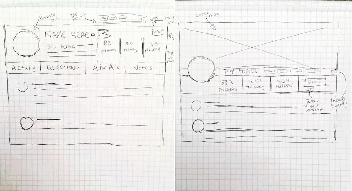
I began by doing a competitive analysis of competitors like Quora and Reddit and then started creating some sketches. "How should the information be laid out?" "Which one seems less cluttered and more easy to read?" After creating some wireframes of my ideas, I worked closely with my manager, Tom on making careful design decisions. I had to follow many constraints and pay attention to the brand and other Yabbly products to make sure it was consistent with them.
Explorations
After figuring out the direction we wanted to take this, I went back and forth with Tom through so many iterations and explorations on that one idea! There were so many different ways we could of done this and so many styles to follow. There were some that were pretty different and some that were really similar with only minor differences. We needed to have specific reasoning for making out decisions and there were a lot of tradeoffs with each.
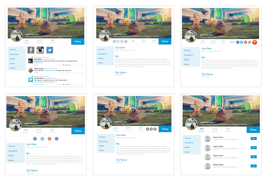
Here are a few examples of the explorations we tested:
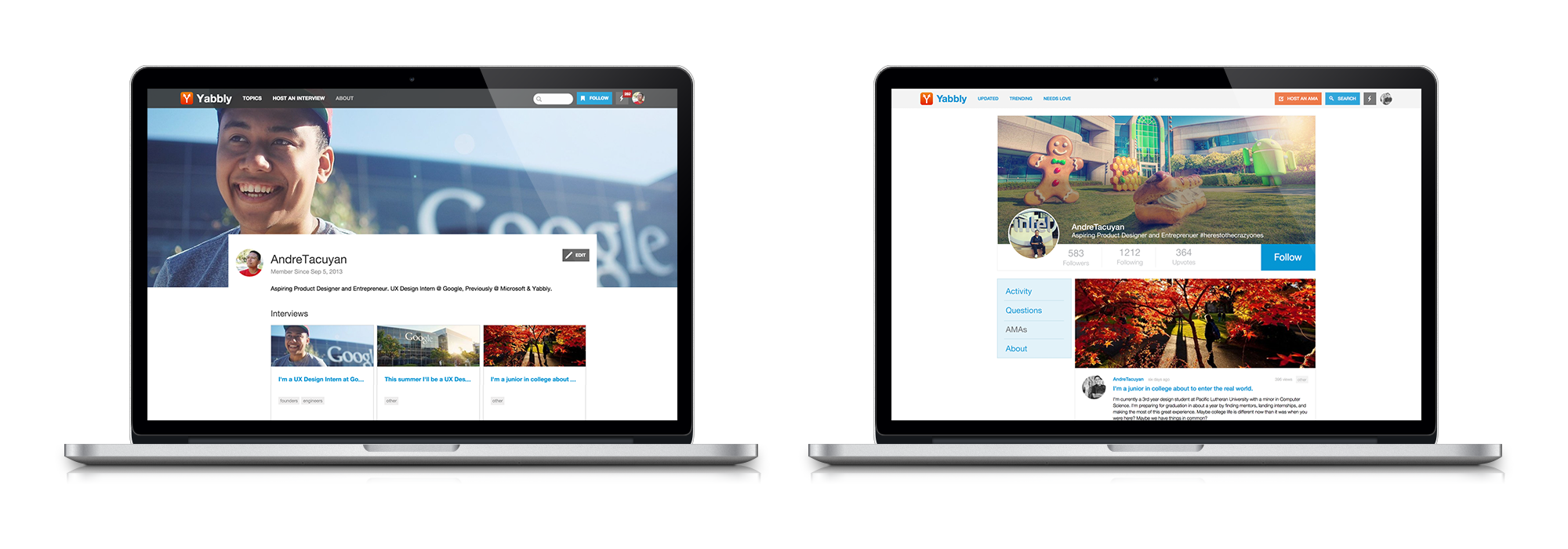
Visual Design
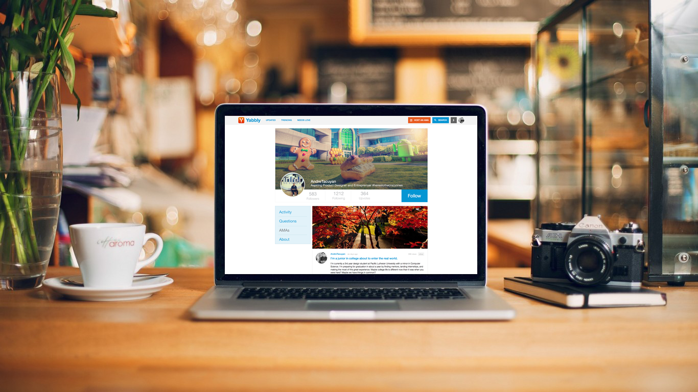
After hashing out all these explorations, I had to make some decisions on the direction to go. Based on my research and some assumptions, I chose a design that was clean and intuitive. There were some tradeoffs though, like not having certain links front and forward but that led me to put actual content that users wanted to see first.
If I were to go back and continue work on this project, I would definitely test this design a little more with users. Do users actually understand this flow and are they getting the most out of it? Do they actually want to see other things or are there some edge cases on user profiles?